
with Allan McLeod
Introduction | Scholarly Essay | Interactive Features | Project Narrative
Project Background by Kim Orcutt
This project is part of a larger study of the American Art-Union that began during my tenure as Henry Luce Foundation Curator of American Art at the New-York Historical Society, where its records reside. It covers but one aspect of a very large and rich subject that has resisted full examination for many decades, perhaps because of the sheer volume of the records, which total 109 bound volumes.[1] Organizing such a large body of material required formats customized to the different types of information contained therein. The goals of this project were twofold: firstly, to illuminate the Art-Union’s crucial importance to the antebellum art world in the United States through the size and nationwide breadth of its membership and of the paintings and sculpture distributed; and secondly, to examine the large number of landscapes made by artists far beyond the handful of familiar names that are traditionally associated with the institution. The conclusions drawn in this study would not be possible without analyzing large amounts of data, and they could not be presented in a clear and compelling manner without visualization tools. They are bolstered by evidence that was simultaneously gathered through more traditional approaches: namely, a close reading of the institution’s internal and external records and an exhaustive study of contemporary newspapers and periodicals.
The Art-Union exhibited and distributed over 4,400 works in fourteen years. This project began with the development of a database to record these works. The information was extracted from the index in Mary Bartlett Cowdrey’s foundational study of 1953.[2] The process was eased somewhat by working from an existing index, albeit one that blended the activities of two different institutions, so that the Art-Union information had to be carefully separated from that of the American Academy of the Fine Arts. The database was supplemented with new information, including classification by genre and prices gleaned from the Art-Union’s Management and Executive Committee minutes, Register of Works of Art, and correspondence. The database could then be used to generate analyses based on a wide range of criteria. In addition, rosters from 1839 to 1850 total over 65,000 total memberships (many of which were renewals from previous years). Spreadsheets for each year were created to record and count members by city and state, which required a heroic effort in tabulating members for each year according to their city of residence. Both the database and the spreadsheets called for diligent and meticulous effort over months and required dedicated assistance.
My main concerns in embarking on a digital humanities project were how to choose the correct visualization tools for the project and how to use them. I participated in “Beyond the Digitized Slide Library,” the 2015 Digital Art History Institute at UCLA, which gave me a general introduction to the types of tools and their capabilities, and the basics of preparing data. However, it became clear that—because this is an exciting early period in the digital humanities—new tools are being constantly introduced and existing ones updated. Each tool has its own conventions and quirks, so a nodding acquaintance with the digital humanities world was not sufficient—an expert partner was an absolute necessity. I was very fortunate to work with an excellent digital collaborator, Allan McLeod.
Since my goal was to demonstrate the nationwide scope of the institution’s impact, mapping was naturally an early choice for a digital tool, and Allan brought his knowledge of the field to bear in choosing the appropriate platform (see his remarks below). While developing the data, I discovered that the membership information was more extensive than I had initially thought, and Allan found solutions for accommodating the additional data while maintaining the map’s functionality. I was also interested in finding the clearest way to demonstrate the predominance of landscapes among the genres of works distributed and in providing underlying data wherever possible in order to show how the quantitative conclusions were reached. Allan suggested a very flexible tool for creating interactive charts that allowed us to illustrate the data both by number and percentage and to embed layers of underlying detail. In addition, Allan created a searchable database of works exhibited and distributed that I hope will be useful to scholars.
Once a platform was chosen, the next major task was refining the data for Allan to work with. Though the information had already been compiled, it had to be carefully examined for accuracy and consistency, and numeric data restated in a usable manner. For this project, the prices offered and paid for artworks proved to be a particular challenge. Data came from orderly sources, such as the ledger titled Register of Works of Art; slightly less organized sources, such as lists of works purchased in handwritten meeting minutes; and in addition, mentions of prices that were scattered throughout thousands of letters to and from artists. These hundreds of odd bits of information had to be placed in a uniform format. In some cases, prices from different sources conflicted, or works were purchased in groups, so a price did not exist for each individual object. Yet, for the purpose of analysis each work had to have a numeric value assigned to it. The resulting graphs and charts seem so specific as to be definitive, but it is important to remember that subjective decisions often underlie seemingly “clean” and exact data. Prices that were estimated because of a lack of information are noted in the object database. For that reason, I welcome queries about specific works and I am happy to provide my colleagues with more details on sources of information and how prices were determined.
I am grateful to the terrifically capable and collegial editorial team at Nineteenth-Century Art Worldwide: Petra ten-Doesschate Chu, Isabel Taube, and Elizabeth Buhe. Most sincere thanks are due to Allan McLeod, an eminently knowledgeable, creative, and accommodating collaborator. The text was masterfully edited by Cara Jordan. Developing the data began many years ago with the encouragement of Linda S. Ferber at the New-York Historical Society and the generosity of its library staff. The project began with the indefatigable assistance of Alice Haas, and it continued under the expert eye of Megan Fort. Numerous researchers contributed to compiling the materials at the New-York Historical Society, including Christina Charuhas, Marilyn Lutzker, Sarah Snook, and Lois Stainman. I am indebted to the colleagues who generously shared materials and answered queries, including Maggie Adler and Spencer Wigmore, Amon Carter Museum of American Art; Deirdre Lawrence, formerly Brooklyn Museum; Valerie Leeds; Thayer Tolles, The Metropolitan Museum of Art; Diana Thompson, formerly National Academy of Design; Sarah Cash, National Gallery of Art; Ken Maddox, Newington-Cropsey Foundation; Arlene Nichols; Evelyn Trebilcock and Valerie Balint, formerly Olana State Historic Site; Alice Duncan, Gerald Peters Gallery; and Eleanor Harvey, Smithsonian American Art Museum.
Project Construction by Allan McLeod
Omeka Neatline
In her proposal for this project, Kim Orcutt identified Omeka Neatline as a possible way to show the membership of the American Art-Union over the years 1839–50 and its distribution of artworks on a map. Neatline promised to be an excellent choice not only because it is a tried and tested “interactive map-making environment,” but also because it has the Simile timeline sub-plugin, with Omeka itself as a database for public access to the information underlying it all.[3] Further into the project, another Neatline sub-plugin, Waypoints, which links a list to the map markers, also became a way to pick out details of the distribution for discussion.
Because this project’s map content is relatively data heavy and narrative light, the combination of Neatline and the sub-plugins best served the visual presentation. (For a comparison of a narrative-heavy and data-light Neatline mapping project, see “Mapping the ‘White, Marmorean Flock’: Anne Whitney Abroad, 1867–1868,” produced by a team including Neatline’s lead developer, David McClure.)[4] All these tools in one toolbox meant that more up-to-date mapping software like Leaflet or timelines like Vis.js offered us less flexibility and were more trouble to integrate.
To develop Kim’s maps so that the lists, tables, and charts that would accompany them responded to the timeline, Neatline’s application programming interface (API) and capacity for theming were far more useful than the advanced features of Leaflet or Vis.js. McClure concisely sums up the API: “snippets of code in the script.js file can hook directly into this messaging system and interact with Neatline just as if they were included in the core codebase.”[5] While a Neatline theme’s script.js file extends and adapts the plugin’s codebase, the style.css file customizes the look of the exhibit. There are also show.php and item.php files that I did not use.
Becoming familiar with the API took time, so the code customization during most of the project development dealt more with the DOM (the Document Object Model of the web page) and directly with the timeline’s codebase and the OpenLayers API, though all via Neatline’s theming capability. By the end of a development period of approximately three months, I was in a better position to take advantage of the Neatline API and it became possible to more robustly adapt the plugins, in particular for interacting with already displayed markers as Neatline records rather than as DOM elements (which, for slippy maps, is a lesson in futility). Consequently, Neatline records tags, as made available by the API, and replaces elements and data attributes as the means to interact with map markers.
While my familiarity with API caught up with my ideas for interaction between the lists, charts, pop-ups, and maps, the Python workflow (described below) filled in the gaps by, for example, generating arrays of recording information to be copied and pasted into a theme’s script.js. By the end of development, that information would be gathered by the script itself via the API.
While Neatline, along with its sub-plugins, themes, and API, proved to be an excellent choice, it is only as good as the data it receives. To prepare and process the data, I used Python, a scripting/programming language noted for quick and easy development.
with open("./Membership_data_FINAL/" + csv_file, "rb") as f:
    csvreader = csv.DictReader(f)

for row in csvreader:
    row_lon = row["Lon"]
    row_lat = row["Lat"]
Data Processing
Kim’s Art-Union data came in the form of spreadsheets. I converted these to comma-separated value (CSV)–formatted files and brought them into Python using the CSV module’s DictReader function, which maps the CSV into keys and values. From there, the data is sliced and diced and put into order for outputting as images (charts using Python library Matplotlib), HTML (tables and lists), or SQL (Structured Query Language) for the Neatline records. Fast development generated rough and ready results to have something to work from. I then fine-tuned the charts, markers, and so on over many versions, experimenting with layout and features. I did not opt for Javascript plugins, such as Highcharts (used elsewhere in the project) or D3.js, for the charts because it was simpler to use Python and, more importantly, using images made it far easier to integrate the charts with the timeline.
Before the slicing and dicing and pie chart making, the data needed to be cleaned. The simplest example of this is stripping the whitespace from around a city name. For a computer, “ New York” with a leading whitespace is distinct from “New York” (so, using Python, city = " New York".strip() gives “New York”). Data preparation also included checking for variations in spelling (“Mt. Morris NY,” “Mount Morris NY”) and historical name changes by finding duplicate latitude-longitude values (using the Python library GeoPy, along with nineteenth-century sources such as The United States Post Office Directory and Postal Guide (1854) and the Statistical View of the United States . . . [1854]).[6] Those results needed double-checking because there are examples of nearly identical places names located next to one another (“Saratoga NY,” “Saratoga Springs NY”).
Anyone who has used a platform such as Omeka may be wondering how this rapid development with many versions and many hundreds of records was possible, since those records would need updating time and again. The final output of the Python scripts (one for each Neatline map) was a SQL file for importing into a MySQL database. Rather than using Neatline’s CSS-like styling to make changes en masse, I simply dropped the MySQL tables of an exhibit and imported the new SQL. The many versions were developed locally using an Apache server with phpMyAdmin. Once there was a version worth showing Kim, I exported the local MySQL database’s SQL and imported it into the MySQL database on the NCAW server.
An example of a SQL row created by the Python script looks like this:
(1424, 1, NULL, 3, '2018–07–01 15:14:48,' '2019–01–20 13:55:02,' 1, 0, 'warwick-ny-1848,' 'Warwick NY,' NULL, ' ', ST_GeomFromText('POINT(-8277703.47611 5050246.77325),'0), 'Warwick NY,warwick-ny,1848,1849|1,1,' '', 'StaticBubble,' '#a50026,' '#ff00ff,' '#000000,' '#e7e7d7,' '1.0,' '1.00,' '1.00,' '1.00,' '1.0,' 5, 873, 873, NULL, NULL, '1848,' '1850,' NULL, NULL, NULL, 7, 9, '7,' '-8283492.47611,4961426.77325')
which corresponds to these Neatline column names:
(`id`, `owner_id`, `item_id`, `exhibit_id`, `added`, `modified`, `is_coverage`, `is_wms`, `slug`, `title`, `item_title`, `body`, `coverage`, `tags`, `widgets`, `presenter`, `fill_color`, `fill_color_select`, `stroke_color`, `stroke_color_select`, `fill_opacity`, `fill_opacity_select`, `stroke_opacity`, `stroke_opacity_select`, `stroke_width`, `point_radius`, `zindex`, `weight`, `start_date`, `end_date`, `after_date`, `before_date`, `point_image`, `wms_address`, `wms_layers`, `min_zoom`, `max_zoom`, `map_zoom`, `map_focus`)
Wishing to place the map markers vertically in order of size, the larger behind the smaller, I tried for a long time to use the SQL z-index field, but it had no effect (nor did “weight”). Eventually a pattern revealed itself: the vertical stacking order corresponded to the order in which the values entered the database and therefore their SQL ID number. So, for example, the Waypoint values of the Distribution map are entered first for them to appear above the pie chart icons. For the Membership map, the SQL values are ordered by membership total.
The markers are located on the map using Neatline’s “coverage” field. The latitude and longitude data from Kim’s spreadsheets needed to be converted to Well-Known Text (WKT), and this is the Python code that does it[7]:
def coordinates_to_point(lon, lat):
    lon, lat = (
        transform(Proj(init="epsg:4326"), Proj(init="epsg:3857"), lon, lat))
    return lon, lat
from which the string for the SQL row is created:
point_lon, point_lat = coordinates_to_point(row_lon, row_lat)
point = "POINT({} {})".format(point_lon, point_lat)
Such data makes the accurate location of the map markers on a georeferenced map possible.
Map Development
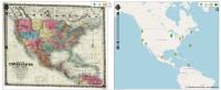
Kim chose a historical map of North America from the David Rumsey Map Collection (Stanford, CA). To georeference (or georectify) a historical map and display it, the Neatline documentation concentrates on ArcMap and GeoServer. The georeferencing is necessary for the historical map so that Neatline can match a coordinate system (fig. 1). Given the complexity of the process described by the documentation and the tales of woe from some who had attempted it, we were lucky that there was an alternative. Following a breadcrumb trail of invaluable experience, in particular from Lincoln Mullen and the “Oxford Outremer Map” documentation, Map Warper offered a far easier and quicker way to get a historical map into Neatline: “an image and map georeferencing or ‘georectification’ service to warp or stretch them to fit on real world map coordinate.”[8]
For most of the development period, Map Warper served the map Neatline displayed using the Web Map Service (WMS) protocol. Though not mentioned in the documentation, Neatline can also use a XYZ static file system to serve the map tiles. This seemed like a good idea because it meant that the project need not depend on Map Warper in the future. The script gdal2tilesG.py converted the georectified TIFF image file downloaded from Map Warper.[9] The following discussions and resources gave enough information for adapting Neatline to XYZ: “Tiled Map Service WMTS,” “Neatline Basemaps,” and “Mapping the Martyrs: How We Did It.”[10] Though it was not mentioned in those accounts, I found that the zoom levels needed to be set in a theme’s script file because the Neatline editor settings appeared to have no effect on XYZ. With the maps in place, it then became a matter of dealing with the many map markers.
Neatline is able to cope with many thousands of records, but, like all mapping frameworks, coping with more than a few hundred visible map markers becomes difficult (for a browser, a georeferenced map marker is a lot more demanding than an image of a point). It is particularly difficult for the timeline sub-plugin to cope because it needs to change those hundreds from one year to the next, with the year on either side of the change needing to be dealt with.
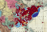
Kim’s American Art-Union membership data came in two batches. The first amount slowed the functioning of the timeline down enough that we needed a compromise. Many of the map marker color changes between years were barely distinguishable, which meant that if those changes were made in steps of twenty-five (the difference of membership numbers between years), then the number of records that needed to change came down to a manageable amount. The second batch of membership data made the twenty-five-step compromise unworkable (though it is used for the New York state map) (fig. 2). There are a number of strategies for coping with large amounts of map markers, among them, the use of raster images and clustering, but these did not seem appropriate because the ability to click the map markers to see more about a location’s data is lost. The simpler solution was to divide the maps, and therefore the data, between the continent as a whole and the individual states. Doing so struck a balance between showing meaningful quantity and making it usable.
One of the most immediately striking things about the Art-Union data is the concentration of membership in New York state compared with the wide distribution of smaller data points. This skewed distribution presented the main problem for visualization. The solution was to have a combination of color and size of marker in what I learned to be “a discrete non-uniform color scale” suitable for data in which “there is a power law in effect—the dense areas are orders of magnitude denser than the sparsely populated areas, and most locations are low-density.”[11] Having tried to generate circles by area, as recommended by data science, I used trial and error and judged by eye, which gave more usable results.[12] This made the markers visible for the lower numbers while not allowing the larger numbers to dominate, with color mediating the extremes.
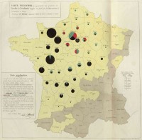
I chose pie charts to serve as map markers for the Distribution map because of their simplicity, both as data representation and as something Neatline could easily display. Their use is not designed for the accurate reading of the data as they appear on the map—that can be done with the charts in the pop-ups—but rather to show the general trend in distribution that Kim identified. Charles Joseph Minard’s near-contemporary use of pie charts in 1858 on a map provided a nice historical precedent (fig. 3). This Stack Overflow answer, “Change Autopct Label Position on Matplotlib Pie Chart,” which I adapted, made possible the staggered placement of the percentages on narrow segments.[13]
The position of the map in the overall layout of the feature went through a number of variations. The primary aim was to show growth in Art-Union membership and the landscape genre in the artworks distributed, which the map markers and timeline convey. A secondary aim was to give the reader access to the data. The variations in layout were an attempt to keep the two aims distinct through different stages of access: (1) map, (2) timeline, (3) list, (4) click for charts and click again for tables.
Some way into the project’s development, I came across the University of Richmond’s “American Panorama: An Atlas of United States History,” in particular “Renewing Inequality: Urban Renewal, Family Displacements, and Race 1955–1966.”[14] These projects, which use their own platform rather than Omeka, are amazing, but risk being overwhelming at first. This is not meant as a criticism; rather, I would like to recognize the different purposes of interactive map projects. While the American Panorama examples stand alone and offer the reader many immediate ways to explore the data, the two Art-Union interactive map features were intended to accompany and complement a scholarly essay. Similarly, so as to not overwhelm the Distribution map, the interactive chart of the distributed artworks by subject uses the Highcharts plugin (which is entirely separate from Omeka or Neatline) to represent the distribution data, in both stacked and line charts.[15]
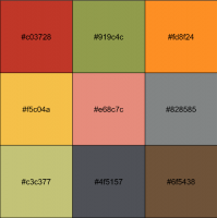
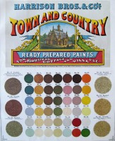
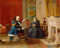
Kim and I settled on a color palette for the genres with the stacked charts. Along with colors from mid-nineteenth century charts, Garrick Aden-Buie’s pomological palette stood out from the many possible palettes created for data visualization today (figs. 4, 5).[16] Kim also gathered reference images, such as period interiors (fig. 6) and colorful mid-nineteenth century Italianate exteriors. I thought non-naturalistic colors would be appropriate (not blue for marine, not green for landscape). However, Kim thought it counterproductive to frustrate the reader’s expectations, which concurs with data visualization advice.[17] Using the pomological palette as a basis, the palette for the charts and Distribution map was created from the period colors, employing naturalism where possible and what worked best based on how the data looked on the charts (size and placement of segment). The colors for the Membership map (eleven values, diverging scheme, color-blind friendly) were found at ColorBrewer.[18]
Collaboration
The exchange about colors is a good example of the dialogue that steered the development of the project, made possible by the project management application Trello. We also needed to find a way to incorporate the Waypoints list with the Distribution map. Initially, I thought we would need two maps because the Waypoints markers and the distribution pie chart icons visually conflicted and made user interaction difficult. Kim responded with characteristic patience and good humor, and with some experimentation a solution presented itself: simply hiding and disabling the unselected Waypoint markers. This was a simple solution that was only possible because of the easy dialogue Trello (and Kim) enabled, together with the flexibility of the Python workflow and the versatility of Neatline.
Along with the enjoyment of collaborating with Kim and the satisfaction of finding technical solutions for the project, it has been fascinating to see the Art-Union’s data come to life. By coincidence, at the beginning of the project I was listening to a BBC podcast on the Mexican-American War.[19] At the culmination of our efforts, I was amazed to see, as I moved the timeline, an 1846 membership in Mexico (Monterrey) and an artwork distribution to California (Santa Cruz), a landscape painting. These two isolated data points made visible by Neatline connect fine art, history, and the changing map of the United States.
[1] For a finding aid, see “Guide to the Records of the American Art-Union,” New-York Historical Society, accessed October 4, 2018, http://dlib.nyu.edu/.
[2] Mary Bartlett Cowdrey, American Academy of Fine Arts and American Art-Union: Exhibition Record (New York: The New-York Historical Society, 1953).
[3] “Neatline from 10,000 Meters,” Neatline, accessed January 1, 2019, http://docs.neatline.org/.
[4] Jacqueline Marie Musacchio, “Mapping the ‘White, Marmorean Flock’: Anne Whitney Abroad, 1867–1868,” Nineteenth-Century Art Worldwide 13, no. 2 (Autumn 2014), http://www.19thc-artworldwide.org/.
[5] David McClure, “Creating Themes for Individual Neatline Exhibits,” Scholar’s Lab, accessed on January 1, 2019, http://scholarslab.org/blog/.
[6] C. R. Rode, ed., The United States Post Office Directory and Postal Guide (New York: Office of the New-York City Directory, 1854), accessed on February 1, 2019, https://books.google.co.uk/; United States Census Office, J. D. B. De Bow, Statistical View of the United States, Embracing Its Territory, Population—White, Free Colored, and Slave—Moral and Social Condition, Industry, Property, and Revenue . . . (Washington, DC: A. O. P. Nicholson, 1854), accessed on February 1, 2019, https://archive.org/.
[7] Antonio Falciano, “Converting Projected Coordinates to Lat/Lon Using Python?,” Stack Exchange, accessed on January 1, 2019, https://gis.stackexchange.com/.
[8] Lincoln Mullen, “How to Use Neatline with Map Warper Instead of GeoServer,” Lincoln Mullen, accessed on January 1, 2019, https://lincolnmullen.com/; Tobias Hrynick, “The Oxford Outremer Map: The Possibilities of Digital Restoration,” The Haskins Society, accessed on January 1, 2019, https://thehaskinssociety.wildapricot.org/; Tim Waters, “About,” Map Warper, accessed January 1, 2019, https://mapwarper.net/about/.
[9] Jean-Francois (Jeff) Faudi, “Gdal2tilesG.py,” Github, accessed on January 1, 2019, https://gist.github.com/jeffaudi/.
[10] “Tiled Map Service WMTS #383,” Github, accessed on January 1, 2019, https://github.com/scholarslab/; Wayne Graham, “Neatline Basemaps,” Github, accessed on January 1, 2019, https://github.com/waynegraham/; “How We Did It,” Mapping the Martyrs, accessed on January 1, 2019, http://www.mappingthemartyrs.org/how/.
[11] Kaiser Fung, “Appreciating Population Mountains,” Junk Charts, accessed January 1, 2019, https://junkcharts.typepad.com/.
[12] “Scaling to Radius or Area?,” From Data to Viz, accessed January 1, 2019, https://www.data-to-viz.com/.
[13] Andrey Sobolev, “Change Autopct Label Position on Matplotlib Pie Chart,” Stack Overflow, accessed on January 1, 2019, https://stackoverflow.com/.
[14] “Renewing Inequality: Urban Renewal, Family Displacements, and Race 1955–1966,” University of Richmond Digital Scholarship Lab, accessed on January 1, 2019, https://dsl.richmond.edu/; see also Cameron Blevins, “American Panorama: Part I,” Cameron Blevins, accessed on February 1, 2019, http://www.cameronblevins.org/.
[15] “Highcharts,” Highcharts, accessed on January 1, 2019, https://www.highcharts.com/.
[16] Garrick Aden-Buie, “ߍ᠇gpomological: A Pomological Ggplot2 Theme,” Garrick Aden-Buie, accessed on January 1, 2019, https://www.garrickadenbuie.com/; Emil Hvitfeldt, “R-color-palettes,” Github, accessed on January 1, 2019, https://github.com/EmilHvitfeldt/.
[17] Lisa Charlotte Rost, “What to Consider When Choosing Colors for Data Visualization,” Datawrapper, accessed January 1, 2019, https://blog.datawrapper.de/colors/.
[18] Cynthia Brewer, “ColorBrewer 2.0,” ColorBrewer 2.0, accessed on January 1, 2019,
http://colorbrewer2.org/.
[19] Melvyn Bragg, Frank Cogliano, Jacqueline Fear-Segal, and Thomas Rath, “The Mexican-American War,” BBC, accessed on January 1, 2019, https://www.bbc.co.uk/.
.png)
