At Once “Ancient” and “Modern”: The Art-Journal’s Illustrated Catalogues and the Notion of Adaptation in Nineteenth-Century Historicism
by Lieske HuitsLieske Huits is a PhD candidate at the University of Cambridge and the Victoria and Albert Museum, where she is working on a reassessment of the narratives of nineteenth-century historicism in the British decorative arts, funded by the British Arts and Humanities Research Council. She obtained her BA cum laude in history of art and architecture from the Free University of Amsterdam and her ResMA cum laude in arts and culture from Leiden University. She has previously received research grants from the Netherlands Interuniversity Institute for Art History in Florence and the Leiden University Fund’s International Study Fund. In September 2021 she was one of the recipients of the AHNCA/Dahesh Prize at the Eighteenth Annual Graduate Student Symposium in Nineteenth-Century Art.
Email the author: lieskehuits[at]gmail.com
Citation: Lieske Huits, “At Once ‘Ancient’ and ‘Modern’: The Art-Journal’s Illustrated Catalogues and the Notion of Adaptation in Nineteenth-Century Historicism,” Nineteenth-Century Art Worldwide 21, no. 3 (Autumn 2022), https://doi.org/10.29411/ncaw.2022.21.3.2.
This work is licensed under a Creative Commons Attribution-NonCommercial 4.0 International License  unless otherwise noted.
Your browser will either open the file, download it to a folder, or display a dialog with options.
Widely considered one of the main resources on Victorian art, the English periodical The Art-Journal[1] dominated the art world during the nineteenth century as the most prominent and widely circulated journal of its kind, published continuously until 1912.[2] Its success was notable, as previous endeavors in art publishing in Britain had all lasted two years or fewer, indicating that there was no real public for publications that dedicated themselves entirely to the arts when the journal was founded in the 1830s. This meant The Art-Journal had a unique position in the publishing market; its direct competition was not other journals on art but “the giants of the Victorian press”: prominent and popular titles such as The Athenaeum, The Illustrated London News, and The Cornhill Magazine.[3] At the base of this success stood founding editor Samuel Carter Hall (1800–89).[4] Hall was a self-appointed spokesman for the arts in Britain, focusing his efforts on all layers of society and all branches of art. While The Art-Journal originally addressed its content to the general public and artists in 1844, an increased interest in industry and manufacturing meant that by the 1860s its intended audience was described as “the artist, the student, the amateur, and the connoisseur” as well as “the manufacturer and the artisan.”[5] This explicit inclusion of the manufacturer and artisan was also reflected in the journal’s contents, which from the mid-1840s onward increasingly covered topics related to industry and “art manufactures.”[6]
Historian Anthony Burton noted that “[t]o the modern student, perhaps the most useful feature of The Art-Journal in Hall’s time is the series of illustrated catalogues of decorative art objects shown at the International Exhibitions, which were issued as supplements to the journal in 1851, 1862, etc.”[7] These illustrated catalogues have become one of the main sources for the study of decorative arts of the period, at least in the British context, and are widely used by scholars examining both decorative arts and international exhibitions, creating an implicit image of them as encyclopedic representations of the exhibitions they report on. At the same time however, they have received little scholarly attention in their own right[8] (and in some instances they have even been confused with other catalogues, such as the Official Descriptive and Illustrated Catalogue of the Great Exhibition).[9]
This article sets out to initiate the study of these catalogues as objects in their own right and as a source on British discourses on style. By examining the way manufacturers and critics in The Art-Journal’s catalogues presented and evaluated historicist manufactures, it will bring to light the underlying logic of appropriation of historic forms and styles that was central to nineteenth-century historicism. Although in recent years scholarship on the nineteenth century has moved toward a less explicitly negative understanding of historicism,[10] there is still a lingering modernist tendency to dismiss historicism as merely imitative, particularly in the decorative arts. This article aims to propose a more nuanced understanding of the use of historic forms in the second half of the nineteenth century, one which foregrounds adaptation over “mere” imitation. Using The Art-Journal’s discussions and representations of jewelry by the London jeweler and goldsmith John Brogden (1820–84) as a case study, it will examine how Brogden’s methods of adaptation were presented as a model for other manufacturers.
Publishing The Art-Journal’s Illustrated Catalogues
In September 1850, The Art-Journal announced its plans to publish a catalogue alongside the Great Exhibition of Works of Industry of All Nations to be held in London the next year. Hall, who had been advocating for a “Great Industrial Art” exhibition to be staged in England since at least 1844, saw the upcoming exhibition as a possible “great school of Art” that would supply suggestions for improvement in all classes of manufacture. The aim of the catalogue was therefore to represent the lessons the exhibition taught in a more permanent form than its inherently ephemeral displays. As the article announcing the catalogue put it, the volume would become “a catalogue of its most beautiful and valuable contents, a permanent record of the Exhibition, and a key to the most meritorious Manufactures of all parts of the world.”[11] Rather than an encyclopedic overview, The Art-Journal catalogue was thus meant to represent only the best or most suggestive works of contemporary manufacturing on display. As the preface to the catalogue made clear, the intended audience was not just a general readership of interested amateurs for whom the catalogue would present an overview of the exhibition but explicitly included manufacturers and artisans “of all classes,” for whom the catalogue would “supply sources of after-education,” “rendering the Exhibition practically beneficial, long after its contents have been distributed.”[12]
Illustrations played a central role in achieving the aims of the catalogue. The 1850 announcement of the catalogue made clear that “mere descriptive matter” would not be enough: “so as to be useful for practical purposes, the only way by which the collection can be effectually represented is by a series of engravings so extensive as to embrace all the leading objects [the exhibition] contains.”[13] Manufacturers were encouraged to submit to The Art-Journal drawings of the main objects they intended to exhibit, which were then turned into wood engravings under the supervision of the prolific wood-engraving business of the Dalziel Brothers.[14] Beyond the depiction of wares displayed, the catalogue also included several essays that would be “permanently useful” in their illustration of lessons from the exhibition; they included topics such as “the science of the exhibition,” “the harmony of colours,” “the vegetable kingdom,” and “machinery [. . .] as applicable to manufacture.”[15] It also included a “prize essay” on the exhibition as “a lesson in taste” by Ralph Nicholson Wornum, who was then lecturer on art at the Government Schools of Design.[16]
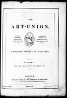
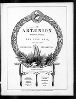
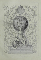
In 1843, when The Art-Journal still was known as The Art-Union, its focus was on “the Fine Arts,” but by 1844 and going forward it had devoted itself to “The Arts Decorative and Ornamental,” with the aim to improve “the Mercantile Value of the Useful Arts” by drawing closer relations between the fine and decorative arts (figs. 1, 2).[17] The integration of decorative arts into the contents of the journal appeared initially through the publication of articles that explored the state and progress of manufacturing in Britain and Europe, calling for the improvement of industrial arts during the first wave of design reform in Britain after the publication of the 1835–36 Report from the Select Committee of Arts and Manufactures. By 1850, The Art-Journal had published illustrated reports on various industrial exhibitions held in France, England, and Belgium. These reports served a dual purpose: to report on the progress of the industrial arts abroad and to contribute to the progress of the industrial arts at home.[18] The catalogue to the Great Exhibition of 1851 (fig. 3) was similar in aim but differed from these initial reports in several ways. First in scale: rather than the single or double supplementary issue of the earlier reports, the 1851 catalogue was published as eight supplementary issues and contained more than fourteen hundred wood engravings, with separate pagination so the supplements could be bound up as a single volume. Second, the 1851 catalogue exhibited a more systematic approach: rather than integrating the overall description of the exhibition and reflections on the development of manufactures on the whole as previous reports had done, it separated the wares and the critical essays on the exhibition, with the wares taking precedence (figs. 4, 5). Third, the catalogue had a more visual character: wares were represented primarily through illustrations, accompanied by short descriptions. Greater emphasis than before was placed on the wares of individual manufacturers, with their names and the names of their products now appearing in capital letters, which would have made it easier for the reader to gather the basic information connected to the illustrations.
Unlike the official catalogue of the exhibition published by Spicer and Clowes—and this is a point the editor of The Art-Journal emphasized at every possible opportunity—having one’s wares listed and reproduced by The Art-Journal did not come at any extra cost to the manufacturers.[19] Instead, the whole cost of creating the engravings and publishing the catalogues was incurred by the journal itself, which not only ensured that all manufacturers were able to submit their wares for inclusion, but also—perhaps more importantly—ensured the editor’s right to “reject all such productions as do not seem to us calculated to be creditable, at least, to all parties.”[20] It is unclear what the exact criteria for selection were, and how many—if any—submissions were rejected. In the combined eight supplements that made up the catalogue, over five hundred different exhibitors from twenty-five different countries were included; more than half of them were from England. Although Hall did not consider the catalogue a financial success,[21] it was successful in other ways: it received largely positive reviews in the press,[22] and it also led to increased circulation numbers for The Art-Journal, which rose from eighteen thousand monthly in 1850[23] to nearly twenty-five thousand in 1851,[24] and, combined with separate catalogue sales, made the journal a total sum exceeding £72,000.[25]
This success translated into the publication of further catalogues to accompany later international exhibitions over the remainder of the century. Under Hall’s editorial leadership at The Art-Journal, fifteen illustrated reports and catalogues were published. Beyond those mentioned earlier, these covered the Dublin Exhibition of Art-Industry in 1853; the Paris Universal Expositions of 1855, 1867, and 1878; the London International Exhibition of 1862; the first and second divisions of the London Exhibitions held between 1871 and 1874; and the Vienna World Exhibition of 1873. After Hall stepped down as editor, further catalogues appeared for the London Colonial and Indian Exhibition of 1886, the Glasgow Exhibition of 1888, the World’s Columbian Exposition of 1893 as well as the Universal Expositions in Paris in 1889 and 1900.[26] Although the later catalogues became more general in their approach to the exhibitions, the catalogues published under Hall all maintained the same aims, pledging to be—as one advertisement put it in 1862—“a Report of Progress, a Volume of Suggestions, a Teacher from lessons of many Master minds, and an enduring Reward to those who labour for renown as well as the ordinary recompense that is expected to accompany desert.”[27]
Style and Adaptation in the Illustrated Catalogues
With the explicit aim of being practically useful to manufacturers and designers, these catalogues included visual and textual information that would make them relevant to their audience. This is especially clear from their explicitly visual character, as wood engravings took up most of the available space on the quarto-size pages, a design central to what Hall considered the catalogue’s practical utility (fig. 6).[28] In the 1860s, he even suggested that the 1851 catalogue over its then decade-long existence had “continued ever since to act as ‘a pattern-book’ not only in remote and comparatively uninstructed districts, but in ‘Works’ that flourish in our great manufacturing cities and towns.”[29]
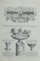
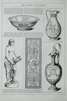
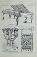
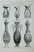
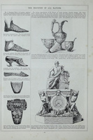
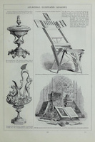
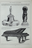
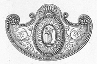
Like pattern-books, the catalogues depicted wares primarily as designs. Illustrations gave little-to-no indication of how objects were displayed at the exhibitions, nor their potential use or the circumstances of their manufacture. In terms of page layout, the illustrations were roughly arranged into a three-column grid, but this structure was far from rigid. For example, in a page from The Art-Journal’s catalogue for the Great Exhibition of 1851, the earthenware jugs displayed by T. & R. Boote (fig. 7) fit neatly into the three-column grid, while on other pages wares were pragmatically spread across multiple columns (fig. 8). In its review of the 1851 catalogue, The Literary Gazette noted how the illustrations lacked “arrangement,” and indeed, the catalogues did not in any form abide by the categories of display a visitor might have encountered in the physical exhibition.[30] Although within a single page a manufacturer’s represented wares would be grouped together, some manufacturers appeared multiple times in different parts of the catalogue, a result of the catalogue being published as multiple supplements. An example of this was the wares of the French bronze manufactory Vittoz, which featured on pages 90, 265, and 284 of the 1851 catalogue (figs. 9, 10, 11). While the different representations of these Vittoz bronzes were several pages apart, within the space of a single page wares were placed together, such as on page 90, where wares by Vittoz are grouped together in the right-most columns, or page 265, where the two Vittoz bronzes are grouped in the left-most column. These pages also show how, oftentimes, wares from different exhibitors in different media and materials and in different styles were placed next to each other on the same page: the Vittoz bronzes appear next to facsimiles of historic shoes exhibited by London shoemaker J. Sparkes Hall (fig. 9); next to a foldable sketching easel exhibited by Oxford manufacturer F. W. Harvey and devotional books exhibited by Belgian publisher Hanicq (fig. 10); and next to an ottoman exhibited by French furniture manufacturer Balny and a piano exhibited by London piano-manufacturers Broadwood (fig. 11). What was thus captured of the displayed manufactures by the engravings was the quality of their designs without reference to scale, material, or even space, making their design—and by extension their use of style—their most prominent feature. Combined with the reader’s ability to flip through the pages of the physical catalogue, this enabled a mode of viewing which centered around comparison between the different wares independently of manufacturer, country of origin, or even material, with the visual quality of wares being the central point of comparison.
Although descriptions of wares were generally brief due to limitations of space, they similarly centered around the visual characteristics of the wares represented. Catalogue entries generally started with information on the manufacturer or exhibitor, followed by short descriptions of the wares depicted and comments on their design, and often included a note on the quality of the works exhibited. For example, one of the shorter descriptions in the 1851 catalogue discussed the Etruscan vases exhibited by ceramicist Thomas Battam as follows:
Mr. BATTAM, of Johnson’s-court, Fleet-street, Enameller of Porcelain and Glass, contributes various TAZZE, VASES, &c., imitations of Etruscan art, in form and ornamentation. These imitations are of rare excellence; in many cases, indeed, they cannot be distinguished, except upon minute scrutiny, from the originals. The vases are of various sizes; the third upon this column is of considerable height—nearly 4 feet.[31]
Mention was often made of materials as well as style of ornament, particularly if the work imitated a specific source or historical style. In some cases, particularly for well-known manufacturers whose wares were depicted over multiple pages, a brief history of the firm was given. Descriptions were deliberately short; less text meant more room for illustrations. These descriptions tended to be laudatory in tone. This can be explained partially by the aim of the catalogues to only represent the most excellent wares displayed at the exhibitions, and partially by the fact that descriptions were formed by combining editor commentary with a text provided by the exhibitor, who was instructed to provide “such information concerning his establishment as it may benefit him to communicate.”[32] This collaborative approach makes it difficult, however, to pick apart which part of a description originated with the manufacturer and which with the editor.
Although descriptions of wares were of limited length, emphasis seems to have been placed on aspects of style and design. Stylistic descriptors featured often, as did descriptions that explained works in relation to a specific historic referent. Words such as “imitation,” “copy,” “facsimile,” and “reproduction” were used repeatedly, and similarly were phrases such as “formed after,” “modeled after,” and “borrowed from.” No clear taxonomy of style was used—probably due to the text being provided by individual manufacturers—so descriptors could refer to a period of time (such as “seventeenth-century style”); to particular periods of history of varying length (such as “medieval,” “Jacobean”) or historic styles of production (“Queen Anne,” “Renaissance,” “Louis XIV”); or even to geographic location (“Greek,” “Roman,” “Egyptian”), where it might refer to that location’s historic or contemporary style. In some cases, labeling was hyperspecific, describing, for example, a style as “Byzantine Gothic of the twelfth century”[33] or as being that of a specific historic artist, such as Grinling Gibbons (1648–1721) or Benvenuto Cellini (1500–1571). Styles that could—and in other cases would—easily be grouped together under a single taxonomic label, such as Moorish and Alhambresque, were often not grouped together at all. There is no indication of The Art-Journal championing one style over another. What seems to have been much more important is that objects made correct use of a style, with the emphasis being on adaptation over imitation.
Within the descriptions of wares, this championing of adaptation can be seen, for example, in the way the journal discussed the work of Josiah Wedgwood (1730–95) over the years, whose ceramics were included in the catalogues of 1851, 1855, 1862, 1867, 1871, 1872, and 1878, and which were considered an example of great British manufacturing. In 1855, the catalogue specified that “in all of the objects which appear in the ‘Wedgwood stall’ in the Exhibition, we observed the most successful adaptation of antique models, both in form and decoration, to modern productions.”[34] Similarly, in 1862, the catalogue of the International Exhibition praised the company for its achievements in “the potter’s art,” “sometimes reproducing from the old models which immortal Flaxman designed, and his associate, immortal ‘Josiah’ executed; but also introducing new forms with modern ornamentation, more adapted to the requirements of the present day.”[35] Here, the catalogue referred to the company’s continued production of its famous pottery in the neoclassical style, designed in the eighteenth century by sculptor and draughtsman John Flaxman (1755–1826) for Wedgwood, the founder of the firm, as well as more modern wares produced to fit the needs of the present. What these “requirements of the present day” were exactly and how these might have been different from the requirements for ceramics in the past was not made explicit. Throughout the catalogue descriptions, in fact, it remained unclear how exactly to judge these adaptations of historic style, although they were celebrated throughout in many different forms and branches of manufactures, from ceramics and furniture to metalwork and jewelry.
“Adaptations from the Antique” and the Jewelry of John Brogden
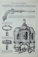
These adaptations of historic forms can be better understood by closely examining how The Art-Journal illustrated catalogues discussed the jewelry of the firm of John Brogden. Brogden, a London-based goldsmith and jeweler, exhibited at various international exhibitions to critical and public acclaim between 1851 and 1878, and was even awarded a gold medal at the Universal Exhibition of 1878 in Paris.[36] His wares were included in The Art-Journal catalogues three times: in 1851, 1867, and 1871. Although Brogden’s firm created jewelry in a range of different styles, it was particularly his works inspired by historical sources that received attention in The Art-Journal’s catalogues. Each time, his wares were described in similar ways: firstly, as worthy competitors to French manufactures, eliciting positive responses at the exhibitions; secondly, as using historic ornament from a variety of sources; and thirdly, as evidence of Brogden being a scholar in his profession, emphasizing a degree of learning and knowledge that he brought to his manufactures. Additionally, Brogden’s wares were discussed in more depth in 1867 in a catalogue essay on “Adaptations from the Antique.” This essay, written by English antiquary and frequent contributor to The Art-Journal Rev. Charles Boutell, discussed the adaptation of historical styles of ornament at the 1867 Paris Universal Exposition with particular reference to jewelry, with Brogden’s wares featured as one of several examples. Boutell highlighted Brogden’s wares as particular examples of adaptation, noting that they were at once “excellent . . . in their capacity of modern ornaments” while simultaneously being “especially valuable as models of ancient production.”[37] For Boutell, Brogden’s wares were able to function both as modern pieces of jewelry, suitable to nineteenth-century consumers, and as representations of ancient production, both in form and, to some extent, in technique. Brogden in his work thus combined the forms of the past with the needs of the present, adapting them to their new use.
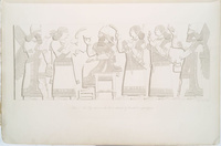
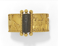
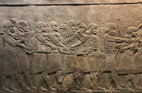
His first inclusion in The Art-Journal’s catalogue to the Great Exhibition of 1851, when Brogden exhibited together with his then business partner James Watherston, reproduced their works in a more naturalistic style, which included seven brooches or “breast ornaments” and a necklace, alongside a bracelet which was said to have been “suggested by the Nineveh monuments” (fig. 12) recently excavated by Sir Austen Henry Layard (1817–94) on the outskirts of Mosul, Iraq, and installed in the British Museum in the late 1840s and early 1850s.[38] Possibly, Brogden took his inspiration for the bracelet from illustrations in Layard’s Nineveh and Its Remains and the collection of lithographs The Monuments of Nineveh, both of which had been published two years earlier, in 1849.[39] Notably, the bracelet does not imitate a specific Assyrian sculpture or relief. Instead, Brogden borrowed a recurring ornamental motif—the floret—and adapted it to a strap bracelet. Several of the figures depicted in Monuments were shown wearing similar floret bracelets (fig. 13), and a floret motif similar to the one used by Brogden appears in many of the plates in Monuments (fig. 14).
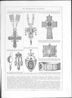
Brogden’s wares were reproduced two more times by The Art-Journal, in 1867—as will be discussed further on—and in 1871 in its Catalogue of the International Exhibition, which took place in London that same year. Wares reproduced included a Russian Orthodox cross, a Celtic cross, Etruscan earrings, and three classical pendants, as well as a bracelet with stylized naturalistic ornament (fig. 15). This time his wares were explicitly described as “reproductions” from various sources, which included “examples of the genius of great artificers of Greece, Etruria, Rome, Venice, Naples, Russia, and other countries; copies from precious relics of past time—treasures of several renowned museums of the world.”[40] At the same time, however, the catalogue noted that Brogden’s wares “generally [. . .] are original in design, but sometimes adaptations from the antique—from the masters who have left us models that may be equaled, perhaps, but not excelled.”[41] This description seemed to betray some humility in relation to the historic masters Brogden aimed at rivaling but remained overall celebratory in tone, noting the “delicacy, grace, and elegance” with which gems were arranged, the “harmonized and contrasted” colors, and “the refinement and finish of the workmanship.”[42] Notably, the catalogue entry described the wares as “reproductions” and “copies,” suggesting a certain closeness to a historical model if not direct imitation, rather than as originals or adaptations as the earlier part of the descriptions suggests. However, with no specific model to juxtapose the wares to, it is difficult to say how closely the wares imitate these supposed originals, if the references were in fact to specific models and not to a more general historic style of production. As Charlotte Gere and Judy Rudoe have suggested, Brogden’s jewels were a medley of motifs from architecture, sculpture, and jewelry.[43] To some extent, however, a clear historic reference must have been at stake for Brogden; as one visitor to an earlier display at the 1867 exhibition had noted, wares were displayed with “small tickets [attached] explaining the history of the things imitated.”[44]
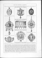
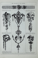
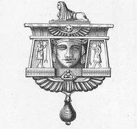
It was, however, in 1867, the second time that Brogden’s wares were reproduced by The Art-Journal, that his objects received the most attention. Those displayed at the 1867 Paris exhibition similarly borrowed ornament from historic sources. The catalogue depicted nine works in total; they included pendants and brooches in Egyptian, Renaissance, classical, and naturalistic styles, as well as a necklace in the Egyptian style (fig. 16). The catalogue described these wares as “borrowings,” with ornament taken “from Pompeii, from Nineveh, from Assyria, from Egypt, and from the collections at the British Museum, the Louvre, Naples, and Copenhagen, that at South Kensington, and several private ‘gatherings’ of ancient relics and modern gems.”[45] As the description made clear, it was especially these historicist wares that were considered some of Brogden’s best work: “Perhaps the best of Mr. Brogden’s works are those he has adapted from ancient models; these, especially, manifest judgement, taste, and skill.”[46] How “judgement, taste, and skill” manifested themselves was discussed further in the aforementioned essay by Boutell on “Adaptations from the Antique.”
In this essay, Boutell drew the reader’s attention to Brogden’s wares in the Egyptian style, which were of such quality that “ancient Egyptian artists would have regarded [them] with warm admiration, such also as the most distinguished of the ancient Egyptians might have been justly proud to wear;” and to Brogden’s “equally successful” works in the Assyrian style.[47] This success, however, was not based on the accuracy of Brogden’s imitation of historic originals; as the author made clear, Brogden’s wares, which included “necklets, armlets, brooches, pendants, and lockets,” deserved this praise because of the “care and discrimination” with which the designs had been “selected and adapted,” as well as their excellent workmanship and overall beauty. What made Brogden’s wares even more “honourable to him,” was that they were based on his “earnest and thoughtful study of the existing ancient authorities,” marking him as an authority on historic originals; similarly, in the catalogue description, Brogden was described as “treat[ing] his art as a scholar.”[48] As the essay made clear however, Brogden was not merely a scholar; his wares were both “excellent . . . in their capacity of modern ornaments” while simultaneously being “especially valuable as models of ancient production.”[49] His jewelry was thus suitable for contemporary consumers to wear without seeming out of time. As the title of the essay thus suggests, it was Brogden’s adaptation of the antique—rather than just its reproduction—that made these jewels so successful as ornaments.
As Boutell stated, Brogden had “not been content with any superficial or imperfect style of reproduction.” Instead, he had made himself “a master of the true principles of the ancient artists,” not merely imitating their wares but creating work “in their spirit and in true sympathy with them.”[50] Brogden’s jewels in most cases were far from direct reproductions of ancient models, instead including a medley of motifs from architecture, sculpture, and jewelry; as Boutell noted, “in many instances the designs may have been obtained from old works of a class and character very different from those of the modern objects to which they are to be applied.” The final product, however, was considered satisfactory because the “adaptation [had been] conducted on a sound system.”[51] Boutell indicated three aspects of Brogden’s system of adaptation that enabled his success: changes in scale, changes in material, and finally, his ability to mimic color with enamel.
Although The Art-Journal’s catalogue illustrations focused primarily on reproducing the designs of wares without conveying aspects of color, material, or scale, it is still possible to assess Boutell’s judgments of Brogden’s work by combining several sources beyond the catalogues. Unfortunately, only a few of Brogden’s wares survive in museum collections, and none of these correspond to wares reproduced by The Art-Journal. Some insight, however, can be inferred from those examples in museum collections that exhibit similar features or styles. In addition, a large collection of designs from the Brogden firm has been preserved in the so-called Brogden Album, which holds almost sixteen hundred colored designs for jewelry and goldsmith’s work, dating between 1848 and 1884. The album is held at the Prints and Drawings Collections of the Victoria and Albert Museum in London, and a few of the jewels depicted in The Art-Journal catalogues correspond to designs from the album, as is shown in figures 17 through 24.
One example that illustrates Brogden’s ability to transform a model into a work on an entirely different scale and in a different material is a gold bracelet (fig. 25) which features a scene from one of the Assyrian lion hunt reliefs, excavated by Layard in the late 1840s (fig. 26). Brogden translated the original gypsum reliefs, which measure almost one meter (39 3/8 inches) in height, into a small gold bracelet measuring less than four centimeters (1 5/8 inches) in height. To account for the reduction in size, he took liberties with the reproduction of the figure groups, condensing the image into an ornament that remains legible in its new context. This can be seen especially well in the figures holding the lion, where the first of which, holding the lion’s head, has been moved forward, and the lion’s paws have been moved downward so as not to appear crowded between the heads of the men carrying its body. Contrastingly, several of the smaller patterns in the figures’ clothing and hair and in the lion’s fur have been scaled up and simplified to make them more legible. Reworking the original scene into a different material also necessitated the use of different techniques: the original relief was carved out of gypsum alabaster, whereas the figures in the Brogden bracelet were applied on top of their golden background. Compared to the original relief, the relief on the bracelet is deeper and appears to have a clearer outline, adding to its legibility in its smaller scale. This is most likely a result of the technique used to construct the bracelet, as the figure groups appear to have been cut out of a separate piece of gold and soldered onto the solid background. Like many of his contemporaries, Brogden participated not only in the revival of styles but in the revival of ancient goldsmithing techniques.[52] One such technique was granulation, in which small granules of gold were soldered or fused onto the surface of a jewel; in the bracelet, this technique has most noticeably been used to create the repeating floret ornamentation on the lower borders and on the clasp framing the black steatite cylinder seal. However, the soldering of the figures onto the background was not a revival of a specific technique. While Brogden could have created a shallower relief by using the technique of repoussé, in which a design is created by hammering the metal into shape from the reverse side, he chose only to use revived techniques—in this bracelet at least—for detail ornamentation, suggesting a pragmatic approach to the revival of historical goldsmithing.
Fig. 25, Firm of John Brogden, Bracelet, ca. 1860. Gold, with a steatite cylinder seal. Victoria & Albert Museum, London. Artwork in the public domain; photograph © Victoria & Albert Museum.
Fig. 26, Return from the Hunt, 645–635 BCE. Gypsum wall panel relief. British Museum, London. Artwork in the public domain; available from: Wikimedia Commons, by Sanjar Alimov, CC BY-2.0.
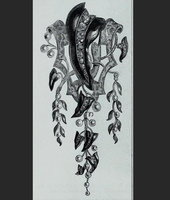
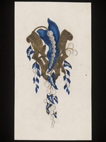
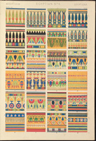
Brogden’s use of color can be assessed by contrasting one of the jewels depicted in the 1867 catalogue (fig. 27) to a design for a necklace from the Brogden Album, which features pendant ornaments in a similar style (fig. 28). Unlike the Assyrian bracelet discussed above, the design does not seem to directly reproduce a specific work of art. The choice of ornament and particularly the use of color suggest, however, that Brogden made use of Owen Jones’s Grammar of Ornament of 1856, as there is a clear similarity between the Egyptian ornaments reproduced by Jones and the decoration of the pendant ornaments designed by Brogden. Particularly striking is the similarity between the lotus ornament on a yellow background, which appears in both the Brogden design and the fourth Egyptian plate in the Grammar of Ornament (fig. 29), as well as the use of yellow, green, blue, red, and black, the dominant colors in the fourth Egyptian plate and those which Brogden would have used when he created the pendant in enamel.[53] Although Brogden does not seem to have copied any of the patterns directly, he used similar colorful geometric forms to evoke the Egyptian patterns depicted by Jones. Although the design, then, does not replicate a historically accurate ancient Egyptian jewel or even a specific architectural panel as in his Assyrian-inspired jewelry, it still would have been recognizably Egyptian to a nineteenth-century audience. Brogden, in his use of ornament, thus adapted historical motifs to modern wares desirable to modern consumers.
Fig. 28, Firm of John Brogden, Jewelry Design, ca. 1860. Pencil, ink, and watercolor drawing on card. Victoria & Albert Museum, London. Artwork in the public domain; photograph © Victoria & Albert Museum.
Fig. 29, Owen Jones (designer) and Francis Bedford (lithographer), Egyptian No. 4: Various Cornices, formed by the Pendent Lotus. Lithograph. Published in Owen Jones, The Grammar of Ornament (London: Day and Son, 1856), plate 7. Artwork in the public domain; available from: Internet Archive.
Conclusion
The Art-Journal’s catalogues were intended not just to memorialize the international exhibitions they reported on but also to provide manufacturers and designers with illustrations of exemplary works displayed. The depicted wares represent suggested directions for the improvement of manufacturing. As this article has shown, one of these lessons was that the use of historic styles—a nearly ubiquitous feature of nineteenth-century decorative arts—was not just about closely imitating the models of the past but about adapting them to the needs and wants of the present. This is expressed not only in the use of illustrations that foregrounded issues of design and style and in descriptions that drew attention to use of historic ornament but also in the discussion of wares exhibited by individual manufacturers, wares which were presented as exemplary. The wares of John Brogden—or rather, how they were discussed by The Art-Journal—provide an example of the underlying logic of appropriation which shaped these adaptations: Brogden’s wares could simultaneously be excellent examples of modern ornament and models of historical production due to his system of adaptation, in which he intentionally transgressed the rules of accuracy to adapt such ornament to the different functions, scales, mediums, and techniques his work necessitated. In other words, Brogden’s works were not just straightforward imitations of the past but conscious reworkings of it, purposefully changing past models to fit modern uses and needs. This suggests that scholars have overemphasized the imitative nature of the phenomenon of historicism. By more closely examining the language surrounding style and its appropriation in the nineteenth century, other approaches to historicism emerge which propose a more complex relationship between the past and its use in the present.
Notes
[1] The journal was known as The Art-Union from 1839 until 1849, when it changed its name to The Art-Journal. Over the course of its existence, the name has been stylized both with and without a hyphen. For the sake of clarity, I refer to the journal throughout as The Art-Journal.
[2] Katherine Haskins, The Art-Journal and Fine Art Publishing in Victorian England, 1850–1880 (Farnham, Surrey, UK: Ashgate, 2012), 2.
[3] Haskins, The Art-Journal and Fine Art Publishing in Victorian England, 65.
[4] For a more detailed history of the journal’s foundation and early years, see Debra N. Mancoff, “Samuel Carter Hall: Publisher as Promoter of the High Arts,” Victorian Periodicals Review 24, no. 1 (Spring 1991): 11–21, https://www.jstor.org/stable/20082494 [login required]; and Haskins, The Art Journal and Fine Art Publishing in Victorian England, 69–71. Despite an increased interest in Victorian publishing and its connection to the arts, a comprehensive analysis of The Art-Journal is yet to be undertaken. Research on The Art-Journal is plagued by a lack of existing archival material, due to the destruction of the Virtue & Company archives during the London Blitz of 1940, with other archival remnants spread across several archival repositories in the United Kingdom and the United States. Both the journal and the catalogues themselves, however, provide a wealth of material that can be supplemented with additional contemporaneous print sources, including international newspapers and journals.
[5] The Art-Journal, December 1, 1861, 4.
[6] In the nineteenth century, no real distinction was made within the term “manufactures” between manufacturing by hand and manufacturing by machine. The Dictionary of Architecture included under the word “manufacture”: “furniture; glass; ironwork; marquetry; metal work; mosaic; paperhanging; parquetry; pottery; tile; woven fabric; wood, and stone, carving, etc.” Similarly, the Society for the Encouragement of Arts, Manufactures and Commerce (1794–1908), whose aim it was to stimulate industry and art, and the 1835–36 House of Commons Select Committee on “arts and their connexion to manufactures,” used the term to refer to any form of large(r)-scale industrial production of applied arts. “Arts manufactures,” a term repeatedly used in the nineteenth century in discussions on art and industry, most often referred to attempts to reevaluate the relationship between (fine) art and manufacture. See The Dictionary of Architecture, vol. 4 (London: Architecture Publication Society, 1853), 32; and Kate Nichols and Rebecca Wade, “Introduction,” in Art Versus Industry? New Perspectives on Visual and Industrial Cultures in Nineteenth-Century Britain, ed. Kate Nichols, Rebecca Wade, and Gabriel Williams (Manchester, UK: Manchester University Press, 2018), 1–5.
[7] Anthony Burton, “Nineteenth-Century Periodicals,” in The Art Press: Two Centuries of Art Magazines, ed. Trevor Fawcett and Clive Phillpot (London: The Art Book Company, 1976), 6.
[8] Haskins (see note 2), for instance, only deals with the publication of fine-art prints through The Art-Journal, but she acknowledges that scholarship on the illustrated catalogues and The Art-Journal’s efforts on behalf of the applied and decorative arts is worthy of its own publication. Due to the destruction of the Virtue & Company archives, Haskins therefore considers the quotidian histories of the Virtue firm and The Art-Journal beyond reconstruction.
[9] For example, a page from The Art-Journal Illustrated Catalogue of 1851 is reproduced with the caption “A page from the Official descriptive and illustrated catalogue of the Great Exhibition, 1851,” in Design and the Decorative Arts: Britain 1500–1900, ed. Michael Snodin and John Styles (London: V&A Publishing, 2001), 342.
[10] One of the clearest examples of the negative perception of historicism can be found in the work of Nikolaus Pevsner, who stated that “all reviving of styles of the past is a sign of weakness.” Nikolaus Pevsner, “The Return of Historicism,” in Studies in Art, Architecture, and Design: Victorian and After (New York: Walker, 1968), 244. For recent reassessments of this view of historicism, see, for example, Revival: Memories, Identities, Utopias, ed. Ayla Lepine, Matt Lodder, and Rosalind McKever (London: Courtauld Books Online, 2015); and Éva Csenkey and Agota Steinery, Hungarian Ceramics from the Zsolnay Manufactory (New Haven, CT, and London: Yale University Press, 2002).
[11] “The Art-Journal Illustrated Catalogue of the Exhibition of 1851,” The Art-Journal, September 1, 1850, 284.
[12] Preface to The Art-Journal Illustrated Catalogue: The Industry of All Nations (London: George Virtue, 1851), v.
[13] “The Art-Journal Illustrated Catalogue of the Exhibition of 1851,” 284.
[14] Preface to The Art-Journal Illustrated Catalogue: The Industry of All Nations, vi. Proofs of the prints are now in the collection of the British Museum, which holds the Dalziel Brothers’ forty-nine-volume archive of proofs. The proofs for the engravings of the 1851 illustrated catalogue are in volumes two (1913,0415.164) and three (1913,0415.165). The online catalogue notes that some of the proofs in the volumes are accompanied by comments in Victorian hand such as “copied from the vase,” “copied from engraving,” and “copied from tracing,” indicating that engravings were not just made after drawings submitted by manufacturers but might have been made at a later stage, possibly even during the exhibition.
[15] Preface to The Art-Journal Illustrated Catalogue: The Industry of All Nations, v.
[16] Wornum would later become keeper and secretary of the National Gallery of London, a position he would hold from 1855 until his death in 1877.
[17] The Art-Union, September 1, 1844, 272; this echoes a message to subscribers announcing the change that had been published in the first number of the year. See The Art-Union, January 1, 1844, 23.
[18] “Exposition of the Products of French Industry,” The Art-Union, August 1, 1844, 225.
[19] “The Exhibition,” Norfolk Chronicle, January 4, 1851, 2, British Library Newspapers, Gale Primary Sources, accessed April 19, 2021, https://link.gale.com/ [login required]; and “Europesche tentoonstelling,” Algemeene nijverheids courant, November 30, 1850, Delpher, accessed April 19, 2021, http://resolver.kb.nl/.
[20] “Minor Topics of the Month,” The Art-Journal, March 1, 1862, 94.
[21] Throughout his editorial commentary and in his autobiography, Hall emphasized that all illustrated catalogues were produced at a loss. He wrote off the failure as a result of the competition with other catalogues, particularly the Official Descriptive and Illustrated Catalogue of the Great Exhibition: “Had the sole right of issuing an Illustrated Catalogue remained in my hands, it is my belief that the venture I embarked upon would have paid.” By the end of 1851, it led to Hall selling his shares in The Art-Journal to his coproprietors, after which he remained as paid editor. See Samuel Carter Hall, Retrospect of a Long Life: From 1815 to 1883 (New York: D. Appleton, 1883), 219.
[22] See, for example, “Art Journal,” The Critic, August 1, 1851, 360; and “Reviews,” The Literary Gazette, September 13, 1851, 623.
[23] The Art-Journal, December 1, 1850, 365.
[24] The Art-Journal, December 1, 1851, 301.
[25] Hall, Retrospect of a Long Life, 219.
[26] Under the editorship of Hall between 1851 and 1881, the journal covered every major international exhibition except for the 1876 Centennial Exhibition held in Philadelphia. This did, however, get covered in a catalogue published by the American edition of The Art-Journal. See “International Exhibition, Philadelphia, 1876,” The Art-Journal, October 1875, 313–14; “The International Exhibition, Philadelphia, 1876,” The Art-Journal, January 1876, 27–28; “Contributions to the International Exhibition, Philadelphia, 1876,” The Art-Journal, May 1876, 153–56, June 1876, 185–88, July 1876, 217–20, August 1876, 245–52, September 1876, 277–84, October 1876, 309–16, and November 1876, 361; “A Retrospective Review,” The Art-Journal, December 1876, 361–70; and “On the Probable Influence Which the Centennial Exhibition Will Have on the Progress of Art in America,” The Art-Journal, January 1877, 7–8. The American edition of The Art-Journal was published by D. Appleton between 1875 and 1881 and then by Patterson and Neilson until 1887.
[27] “Advertisement,” in The Art-Journal Illustrated Catalogue of the International Exhibition (London: James S. Virtue, 1862), iii.
[28] “The Art-Journal Illustrated Catalogue of the Exhibition of 1851,” The Art-Journal, September 1, 1850, 284.
[29] The Art-Journal, December 1, 1861, 353.
[30] “Reviews,” The Literary Gazette, September 13, 1851, 623.
[31] The Art-Journal Illustrated Catalogue: The Industry of All Nations, 18.
[32] These words are from a letter appearing within an untitled notice in an issue of The Examiner in 1850. The Examiner, October 26, 1850, 696, British Library Newspapers, Gale Primary Sources, accessed April 19, 2021, https://link.gale.com/ [login required].
[33] This particular example is from The Illustrated Catalogue of the Universal Exhibition (London: Virtue, 1868), 293.
[34] The Exhibition of Art-Industry in Paris, 1855 (London: Virtue, 1855), 9–10, emphasis mine.
[35] The Art-Journal Illustrated Catalogue of the International Exhibition, 1862 (London: James S. Virtue, 1862), 6.
[36] Diana Scarisbrick, “Archaeological Jewelry in the Orbit of Castellani,” in Castellani and Italian Archaeological Jewelry, ed. Susan Weber Soros and Stefanie Walker (New Haven, CT: Yale University Press, 2004), 323.
[37] Rev. Charles Boutell, “Adaptations from the Antique,” The Illustrated Catalogue of the Universal Exhibition (1868), 155.
[38] The Art-Journal Illustrated Catalogue: The Industry of All Nations, 80.
[39] It should be noted that Assyrian imagery proliferated in the British illustrated press from the mid-1840s onward, as has been discussed by Mari Hvattum, “Heteronomic Historicism,” Architectural Histories 5, no. 1 (2017): 6, http://doi.org/10.5334/ah.216.
[40] The Art-Journal Catalogue of the International Exhibition, 1871 (London: Virtue, 1871), 61.
[41] The Art-Journal Catalogue of the International Exhibition, 1871, 61.
[42] The Art-Journal Catalogue of the International Exhibition, 1871, 61.
[43] Charlotte Gere and Judy Rudoe, Jewellery in the Age of Queen Victoria: A Mirror to the World (London: British Museum, 2010), 382.
[44] W. G. Deeley, “Jewellery, With Diamonds and Precious Stones,” Reports of Artisans Selected by a Committee Appointed by the Council of the Society of Arts to Visit the Paris Universal Exhibition, 1867 (London: Bell and Daldy, 1867), 45.
[45] The Illustrated Catalogue of the Universal Exhibition (1868), 159.
[46] The Illustrated Catalogue of the Universal Exhibition (1868), 159.
[47] Boutell, “Adaptations from the Antique,” 154–55.
[48] The Illustrated Catalogue of the Universal Exhibition (1868), 159.
[49] Boutell, “Adaptations from the Antique,” 155.
[50] Boutell, “Adaptations,” 155.
[51] Boutell, “Adaptations,” 155.
[52] Charlotte Gere, European and American Jewellery, 1830–1914 (London: Heinemann, 1975), 156–57. On the study of ancient goldsmithing techniques in the nineteenth century, see Elizabeth Simpson, “‘A Perfect Imitation of the Ancient Work’—Ancient Jewelry and Castellani Adaptations,” in Soros and Walker, Castellani and Italian Archaeological Jewelry, 200–226.
[53] Charlotte Gere and Judy Rudoe have suggested that the use of enamel might have added a sense of authenticity to the jewels, as colored glass inlays in ancient jewelry were misunderstood at the time and thought to be enameling on gold. Gere and Rudoe, Jewellery in the Age of Queen Victoria, 382. Boutell’s praise of Brogden’s use of color and the similarities between Brogden’s use of color and the plates from the Grammar of Ornament seem to suggest the same thing. Boutell, “Adaptations,” 156.