American Art History Digitallysponsored by the Terra Foundation for American ArtWest on the Walls: The 1807 Exhibition of the Pennsylvania Academy of the Fine ArtsProject Narrative
by Wendy Bellion, Lea C. Stephenson, and James Kelleher, with Allan McLeod and Kristen Nassif
Wendy Bellion is professor of art history and Sewell C. Biggs Chair in American Art at the University of Delaware, where she also serves as director of the Center for Material Culture Studies. Her research focuses on eighteenth- and nineteenth-century art and material culture in North America and the Atlantic World. Her major publications include Iconoclasm in New York: Revolution to Reenactment (Penn State University Press, 2019) and Citizen Spectator: Art, Illusion, and Visual Perception in Early National America (University of North Carolina Press, 2011), which was awarded the Charles Eldredge Prize by the Smithsonian American Art Museum. A forthcoming volume, Things Change: Material Cultures of the Mobile Eighteenth Century, coedited with Kristel Smentek, will be published by Bloomsbury Academic in 2023.
Email the author: wbellion[at]udel.edu
Lea C. Stephenson is a PhD candidate in art history at the University of Delaware. Her work focuses on late nineteenth-century American and British art, specifically the Gilded Age and the relationship between the senses, embodiment, and portraiture. Her current projects explore late nineteenth-century Egyptomania and the relationship between American Orientalism and empire. She received her MA from the Williams College Graduate Program in the History of Art in 2017. Stephenson has also previously worked at the Philadelphia Museum of Art, Preservation Society of Newport County, Dallas Museum of Art, and the Clark Art Institute.
Email the author: lcsteph[at]udel.edu
James Kelleher is an architectural historian and museum professional specializing in the seventeenth through early nineteenth centuries. He received his master’s degree from the Winterthur Program in American Material Culture, where his thesis focused on domestic architecture in southeastern Massachusetts from 1650 to 1720. His research interests include the persistence of English traditions in Colonial American building, the intersections of architecture and social life, and local variations in building practices.
Email the author: j.ian.kelleher[at]gmail.com
Citation: Wendy Bellion, Lea C. Stephenson, and James Kelleher, with Allan McLeod, “Project Narrative,” in Wendy Bellion, Lea C. Stephenson, and James Kelleher, with Allan McLeod and Kristen Nassif, “West on the Walls: The 1807 Exhibition of the Pennsylvania Academy of the Fine Arts,” Nineteenth-Century Art Worldwide 21, no. 1 (Spring 2022), https://doi.org/10.29411/ncaw.2022.21.1.21.
This work is licensed under a Creative Commons Attribution-NonCommercial 4.0 International License  unless otherwise noted.
Your browser will either open the file, download it to a folder, or display a dialog with options.
Scholarly Article|Interactive Feature|Project Narrative
“West on the Walls” reconstructs one of the earliest art exhibitions in the United States and the first display of paintings at the Pennsylvania Academy of the Fine Arts in 1807. The project is the result of collaboration by three art historians, an architectural historian, and a web developer. In this project narrative, team members explain their methodologies and technologies. Wendy Bellion discusses the project’s origins as well as the challenges and discoveries encountered over the course of its development. James Kelleher, who created AutoCAD drawings of the lost academy building—and one of the interactive digital features, a 3-D reconstruction of the academy interior and exhibition in Blender—traces the archival documentation and extant architectural evidence that he drew on to visualize these long-lost spaces. Allan McLeod, web developer for Nineteenth-Century Art Worldwide (NCAW), explains the platforms and processes that he used to build the main digital feature, the interactive sketch of Charles Willson Peale’s installation plan for the exhibition.
Project Background by Wendy Bellion
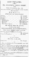
“West on the Walls” grew out of ongoing research for a book about the intersections of painting and theater in the early national United States. Benjamin West’s enormous pictures King Lear (1788) and Hamlet: Act IV, Scene V (Ophelia before the King and Queen) (1792), which Robert Fulton acquired from the sale of John Boydell’s Shakespeare Gallery, formed a linchpin in this cultural landscape: shortly after the paintings went on display at the Pennsylvania Academy in November 1807, Philadelphia’s Chestnut Street Theatre, which was located just a few blocks away from the academy, staged back-to-back productions of the very same plays (fig. 1).[1] This hardly seemed a coincidence. Yet it also raised a host of questions. Did the theater’s managers seek to capitalize on the enthusiastic reception of West’s paintings? Did the academy and theater share an audience? If so, how did they experience the same Shakespearean narratives differently in paint and on stage?
In pursuit of answers, it seemed necessary to better understand how West’s paintings were presented at the academy. Carrie Rebora’s groundbreaking article “Robert Fulton’s Art Collection” (1990) provided essential background about the exhibition and the works assembled by the collector.[2] Peale’s sketch of the installation offered another important starting point: in addition to drawing the location of paintings on the wall, Peale explained his decisions in a letter to Fulton. As I quickly realized, however, Peale’s sketch represented at best a partial documentation of the exhibition; Peale charted his progress while making notes that underscored the incomplete nature of his drawing, such as “Space left to put others which I shall place tomorrow.” Nevertheless, I attempted a rough visualization of Peale’s sketch using the technology art historians know best—PowerPoint (fig. 2)—and shared the results in symposium papers presented at the Paul Mellon Centre for Studies in British Art and the Philadelphia Museum of Art.[3] The scale of this draft visualization was approximate at best; likewise, the mock-up featured educated guesses as to several paintings unidentified in Peale’s sketch. And, as I would later learn, neither the color nor the plane of the wall was correct. Nor did this early visualization account for some of Peale’s annotations that were, even at the time, mysterious, such as the letters and vertical lines denoting “G. Baise” at the right of the sketch. Still, the enthusiastic response to this first effort persuaded me that this project was worth further development.
Fig. 2, Wendy Bellion, Preliminary PowerPoint mock-up of the 1807 exhibition, ca. 2014. Courtesy of Wendy Bellion.
And then the global pandemic hit. While the COVID-19 pandemic brought the familiar rhythms of life to a standstill in the spring of 2020, it illuminated the potential of a digital humanities project, which could be advanced from the relative safety of a laptop during a public health emergency. At the same time, it became apparent that other kinds of opportunities were rapidly disappearing, including the research travel and summer internships that several of my graduate advisees had planned for summer 2020. And so, we collectively pivoted, to use a pandemic keyword: we redirected our energies to develop “West on the Walls.” I hired my PhD advisee Lea Stephenson, who was already working on her own NCAW digital publication, to research the paintings shown at the academy and write captions for the interactive version of Peale’s sketch.[4] Kristen Nassif, another PhD advisee, tracked down the current locations of the paintings and processed all of the rights and reproductions permissions. James Kelleher, a recent graduate of the Winterthur Program in American Material Culture, added a deep understanding of early American architectural history, AutoCAD know-how, and a willingness to learn new digital technologies. Allan McLeod, who had previously developed a range of digital projects for NCAW, kindly shared his technological expertise, advised on various platforms, and built the interactive Peale sketch.
I am immensely grateful to each of these talented, thoughtful, and hardworking individuals. I also extend a huge thanks to the NCAW team for their encouragement, guidance, and feedback throughout this project: Petra ten-Doesschate Chu, Isabel Taube, Kimberly Orcutt, and NCAW’s tireless digital art history editor, Carey Gibbons. David Schwittek reviewed drafts of the digital components and offered valuable feedback. The Terra Foundation for American Art, which supports NCAW’s American Art History Digitally series, made this project possible. Funding from the University of Delaware helped support research stipends and illustration expenses.
Our work was not without challenges. We were only able to come together virtually throughout this project, meeting on Zoom and communicating on a Trello board. And while we were fortunate to be able to consult many primary-source documents in digital, print, and microfilm formats (in particular, the invaluable Selected Papers and Collected Papers of Peale and his family), we could not access some resources due to ongoing pandemic restrictions at institutions.[5] We also reckoned with the scarcity of contemporary accounts of the 1807 exhibition and the difficulties of tracking down or concretely identifying a number of the pictures in Peale’s sketch. We are immensely grateful to the dedicated archivists, librarians, and curators who located materials and remotely answered our questions, especially Hoang Tran, director of archives at the Pennsylvania Academy of the Fine Arts; and Layla Bermeo, Kristin and Roger Servison Associate Curator of Paintings, Art of the Americas, at the Museum of Fine Arts, Boston.
Given these obstacles, we had to rethink aspects of our digital components. We had initially imagined a complete three-dimensional reconstruction of the academy exhibition on the model, if not the scale, of the impressive digital recreation of the Lenox Library Picture Gallery, created by a team led by Sally Webster and David Schwittek.[6] However, faced with the limits of our knowledge about certain works of art, as well as the exact nature of Peale’s hanging, we refocused our objective as a speculative digital visualization of Peale’s sketch. That is, rather than attempt a holistic recreation of an exhibition for which we had only partial information, we decided to highlight the sketch, our primary source of visual documentation, as the central digital component and demonstrate what it did (and did not) communicate about the exhibition.
In this, we followed the example of scholars including Catherine Roach, who has emphasized the importance of visualizing ambiguity in digital reconstructions and transparency about one’s working processes. Roach’s reconstructions of installations at the British Institution draw on historical data, including period images of installations and the measurements of architectural spaces and canvases, but they also explicitly identify unlocated paintings through the use of blank squares and explain substitutions in other media. As Roach argues, “an awareness of the historiography of exhibitions and the limitations of our sources” permits an “exhibition reconstruction that illuminates the process of making both nineteenth-century exhibitions and their twenty-first-century representations. Instead of certainty, we can offer exploration.”[7]
This approach still enabled us to investigate key questions posed by our research: Was there a logic to Peale’s installation plan for Fulton’s collection? Why did he add selected paintings from his own collection to the walls? Did he generate conversations between paintings by grouping certain works together? How did Peale work with the architecture of the academy gallery? Did his design reflect period exhibition conventions and/or repeat installations practiced at his Philadelphia Museum? How did academy visitors navigate the gallery space?
While our scholarly article explicates these matters in narrative form, the interactive Peale sketch allows users to explore the concept, content, and arrangement of the paintings based on our available knowledge to date. McLeod suggested several platforms for visualizing our findings, including Neatline for Omeka, and he built the digital sketch in OpenSeadragon (see McLeod’s section below for further details). We opted to create four navigable sections: (1) Peale’s installation design, which explains the architecture as well as features that Peale added, such as baize curtains; (2) identified paintings (with substitutions for unlocated pictures marked in gray), which users can click to learn about individual works; (3) artists Peale named in his sketch but whose works we cannot identify with certainty; and (4) paintings known to have been included in the exhibition, thanks to contemporary accounts, but undocumented in Peale’s sketch.
Notably, the process of digitizing Peale’s sketch allowed us to discern and analyze aspects of the exhibition in ways that the textual records alone did not make apparent. We were able to see how Peale created an anchor for the exhibition by hanging West’s large paintings at the visual center of the display and Robert Smirke’s Columbiad paintings horizontally below. We could understand how this arrangement concurrently worked to recommend West’s art to the academy’s directors and to promote The Columbiad, a joint publication of Fulton and Joel Barlow, to potential readers and buyers. We noticed that another grouping of portraits—of West, Fulton, and Rubens Peale—functioned similarly to associate the Peale family with a powerful cultural network. And we observed that Peale privileged spatial qualities of balance and symmetry by pairing certain pictures, thereby manifesting a period taste for pendants in public exhibitions.[8]
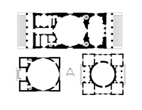
Kelleher’s reconstructions of the lost academy building also allowed us to realize what we were not seeing in Peale’s sketch: namely, the curved walls of the academy gallery and the installation challenges this architecture presented. We knew at the outset of our project that it would be helpful to produce a plan, elevation, and cross-section of the academy building; Kelleher’s AutoCAD drawings offer visual representations of the design, scale, and ornamentation of the building’s façade and interior for the first time since 1809, when the Port Folio reproduced an engraving of the exterior.[9] Just as important, these images revealed that Peale had misrepresented the nature of the gallery space in his sketch. Peale’s diagrammatic plan represents the paintings as if arrayed on a flat, continuous wall separated by two small doorways; Kelleher’s drawings, together with the 3-D panoramic reconstruction he created in Blender, showed that Peale omitted an opening in the gallery wall exactly where the paintings of Lear and Ophelia came together. The 3-D reconstruction makes the awkwardness of this installation apparent: the pictures overhang the space in unequal proportion. We do not know why Peale omitted this detail in his sketch, nor do we understand how he managed to physically hang enormous framed paintings across a gap on curved walls. Yet without the digital plans and reconstruction, we would not have discovered these problems at all. Below, Kelleher explains how he produced these visual reconstructions and how we arrived at details, including the appearance of the academy walls, the color of the floor cloth, and Peale’s placement of the baize curtain.
Academy Plans and 3-D Blender Reconstruction by James Kelleher
Our Academy of Fine Arts is ready to be opened . . .
– Charles Willson Peale, March 28, 1807
Methodology
I was approached by Dr. Bellion in spring 2021 to consult on an architectural interpretation and visual reconstruction of the first Pennsylvania Academy of the Fine Arts building, as described by contemporary sources. I was able to use written descriptions, particularly those published in the Port Folio in 1809, contemporary images, and related buildings, both extant and demolished, as evidence in reconstructing the academy.[10]
It is important to note that there is a range of conjecture in this reconstruction. The details about which we are most certain relate to the exterior shape, which is attested by two prints, created by two different artists, at distinct times and from divergent angles of view. That these views mostly agree with one another in form and detail suggests their accuracy. Even so, specific details, such as moldings and capitals, had to be gleaned from contemporary sources.
A second level of conjecture, somewhat less certain than the first, concerns the interior floor plan. The Port Folio description is largely clear and specific, and, as such, it was written by someone familiar with the building both during and after construction. Fortunately, I was able to cross-reference some elements of the description with other sources, described below. Nevertheless, there are numerous elements that are impossible to determine from currently available data, including wall thicknesses, specific room shapes, and the precise placement of fireplaces and staircases.
The third and least certain level of conjecture relates to interior details. Barring the discovery of new information about this destroyed building, there is no way to know the form, size, or color of interior moldings, finishes, doors, hardware, etc. Likewise, the exact dimensions and locations of doorway openings must for now remain speculative. I have endeavored to use plausible, period-appropriate details in this reconstruction to suggest one of several possible forms that the interior could have taken. Nevertheless, almost all elements mentioned in the Port Folio description are accounted for in the reconstruction and related architectural drawings, including the recesses, pedestals, moldings, fireplaces, and the arches protruding into the dome with surrounding moldings.[11]
The plan, section, and elevation were all drawn in AutoCAD 2019. For the three-dimensional and panoramic renderings, I used Blender (version 2.9), a free and open-source modeling software that is more than adequate for the task. While AutoCAD is capable of modeling three-dimensional objects and structures, Blender is a robust rendering engine that produces naturalistic results in the final images.
Context and Antecedents
The public affront put upon me as a professional man, in the erection of the Academy of Art from the design of John Dorsey,—would have driven any Artist from it . . .
– Benjamin Henry Latrobe, 1806
Dorsey evidently drew freely from the work of his contemporary Benjamin Henry Latrobe (fig. 3). Latrobe himself considered Dorsey a dilettante, undercutting his business by providing designs gratis. Two of Latrobe’s most visible Philadelphia buildings, the Bank of Pennsylvania and the Centre Square Waterworks, seemingly had strong influences on Dorsey’s design for the academy. From the Bank of Pennsylvania, Dorsey adapted Latrobe’s rotunda, which featured eight recesses around the perimeter. Likewise, he borrowed Latrobe’s scheme of recessed attic panels above doorways. Dorsey’s rotunda was forty-six feet in diameter, a foot larger than that in the Bank of Pennsylvania. From the waterworks, he borrowed the columns between pilasters, the recessed central sections in the exterior walls, and the continuous entablature around the building. The academy was much more on the scale of the waterworks than the extravagantly large bank.[12]
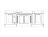
Exterior
The principal sources for the reconstruction of the exterior elevation (see fig. 10 in the scholarly article) are two images of the Pennsylvania Academy of the Fine Arts’ first building, coupled with a contemporary description published in the Port Folio (1809). The two exterior views, published in 1809 (see fig. 7 in the scholarly article) and 1827,[13] are taken from different angles but agree in their representation of the building. Dorsey and his workers built a rectangular structure of fifty by sixty feet, with an elevation of two stories above a raised basement, the whole topped by a shallow dome. Central sections of the side walls are recessed, and the building is entered through a recessed porch behind two Ionic columns in antis, flanked by Ionic pilasters. The cornice over the entry porch was apparently topped with an eagle in front of a sunburst or similar pattern. The eagle is visibly clutching an artist’s palette. Perhaps this was an analogy to the Great Seal of the United States, in which an eagle clutches both an olive branch and a group of arrows. A continual cornice runs along the top of the second story. While not visible in any contemporary images, the front porch was apparently paved in marble, with a center section of black marble with white flecks, described in the Port Folio. This paving may well have been a checkerboard pattern of light and dark King of Prussia marble, which would later appear in the Second Bank of Philadelphia, among other buildings. (For further discussion of the bank’s design, see the scholarly article.)
For this reconstruction, I have adapted the two Ionic columns on the front, in their basic proportions, from those of Latrobe’s Bank of Pennsylvania, built between 1798 and 1801. After the bank building’s destruction in 1867, one of these columns was repurposed as a war monument in Adrian, Michigan, from which Historic American Buildings Survey drawings were taken.[14] I used these measurements to recreate the columns on the academy building’s porch.
The exterior moldings are adapted from Owen Biddle’s Carpenter’s Assistant as well as the two published engravings of the academy’s exterior.[15] Biddle was contracted to build the academy building (he died during construction), and it therefore seems likely his Ionic stone entablature for the academy would have matched his published interpretations.[16]
The dome’s height is basically conjectural, but an estimate was obtained by tracing over the perspective lines of the print and carrying the heights forward into an elevation. The published exterior views do not suggest a dome any higher. The section, meanwhile, suggests that the dome could not be much lower without disrupting the arched recesses, discussed below (see fig. 12 in the scholarly article).
Interior
The floor plan proposed here accounts for all the spaces described by the Port Folio in 1809: a rotunda, two rooms, and three chambers (including one over the porch). Positions of fireplaces and stairs are partly dictated by necessity and the position of exterior chimneys, and partly by Dorsey’s preliminary sketch of the building’s plan (see fig. 5 in the scholarly article). While differing in several details from the final building, Dorsey’s sketch illustrates his basic concept, which probably remained largely intact through construction. The exterior dimensions and the size of the rotunda left relatively little space to fit staircases and fireplaces as well as connecting halls. Back rooms could not contain staircases as they would have no way of communicating with the front rooms on the other side of the rotunda. These two rear rooms, roughly triangle shaped, likely had blocked off fireplaces to be used when the building was expanded, per the Port Folio description. They have been omitted in the floor plan for clarity, as they were apparently not intended to be used when the building was in its first stage.
In one of his letters, Peale describes the rotunda as having five doors, all of which appear in the Blender reconstruction.[17] Two doors led to the front rooms (Peale describes the west room as the “keeper’s room”), two opened to the triangular rooms at the rear, and the fifth was the main entrance (“the big door,” according to Peale, adjacent to which he hung Antonio Balestra’s Death of Abel, fig. 18 in the scholarly article).
The building’s principal space, the rotunda, is well described in the 1809 Port Folio article. The author gave the diameter as forty-six feet, while Peale described it as forty-five feet.[18] A masonry dome above rested on arches spanning eight curved load-bearing walls (called “pedestals” by the Port Folio). The recesses were filled with thin masonry walls, some apparently intended to be knocked through for doors if and when the building was expanded in various directions.
This is a structurally ambitious scheme that recalls nothing so much as the rotunda of John Soane’s Bank of England, the dome of which likewise rested on arches above the barrel. To Dorsey’s credit, this was a departure from Latrobe’s work, and a feat of masonic ingenuity that clearly impressed the Port Folio’s anonymous correspondent, who took specific care to describe it.[19] The arches spanning the load-bearing walls were surrounded with moldings (described, somewhat cryptically, as “reversed moldings”). By necessity, these followed the complex curve formed by the intersection of the arches and the dome’s interior, and they were likely made of plaster. A plaster design, described by the journal as a “radii of light in stucco,” surrounded the oculus. This may have been a sort of sunburst, with rays radiating from the oculus. For the reconstruction, I have largely copied the ornament around the oculus above the Pennsylvania Hospital’s 1804 surgical amphitheater, a building with which Dorsey was probably familiar. I have scaled up the ornament to match the much larger size of the academy’s dome.
The oculus probably served as the only source of natural light into the rotunda. According to the Port Folio, the dome had a “sole light from its center,” a description that suggests the dome had only one opening or the whole room was lit solely from the oculus. It is also possible that some of the upper recessed panels in the walls included openings for windows, although this is not specifically suggested in what is otherwise a fairly explicit description. Peale likewise describes the space as “lighted from the centre of the Dome.”[20] Front lower rooms were lit by the semicircular windows, while upper rooms were lit by small rectangular windows, both visible in the elevation.
Each of the recessed walls had a doorway or panel, plus an attic panel above. The three recesses toward the front contained the front door and doors to the two front rooms and staircases; the two at the back likely went to corner spaces intended to be enlarged at a later time. The recesses at the rear and sides were intended to be knocked through as additions were made in these directions, and they were described as only four inches thick at their narrowest. It is unclear whether the doorways to the front and back rooms actually had doors in them. Simple six-panel doors have been fitted in the reconstruction, but it is equally likely that the doorways were open.
I have interpreted each recess as six feet wide. The recesses in the rotunda at the Bank of Philadelphia were roughly eight feet wide, but at the academy such a width would seem to leave too little wall space to adequately display large paintings (already a challenge on curved walls). Conversely, recesses narrower than six feet would appear too attenuated and would somewhat lessen the effect of the arches above. This is ultimately a judgment call on what “looks right” and is open to change if new data appears.
The interior moldings required more conjecture. Lacking any drawings from Dorsey, this imagery was adapted from contemporary work by Latrobe (fig. 4). Dorsey was clearly borrowing heavily from Latrobe’s local work, so it is reasonable to use Latrobe’s well-documented buildings as the basis for details in the academy. The cornice and “semicircular architraves” around the arches were taken from molding profiles at Latrobe’s Baltimore Basilica (begun 1806). While this is not a local building, it is public, contemporary, and accessible, and may well represent molding profiles with which Dorsey would have been familiar. Doorframe and attic panel moldings are identical to one another and were adapted from Latrobe’s drawing of details in a house for John Markoe in Philadelphia (1809).[21] The proportions of the attic panels are inspired by those in the rotunda of the Bank of Pennsylvania, which were likely Dorsey’s inspiration as well. Colors for the model come from Latrobe’s detailed instructions for painting the Bank of Pennsylvania’s rotunda, which specified warm, straw-colored walls, a paler yellow for the panels, and white moldings.[22] The specific colors were taken from a page of distemper wall-color samples painted in 1807 in Scotland. That these colors match both the precise year and medium of the wall painting at the academy is a fortunate coincidence.[23] According to a letter from William Biddle to Nicholas Biddle, the floor was covered with a green floorcloth, suggesting a wooden rather than a paved floor.[24] These details helped inform the appearance of the exhibition room in the interactive 3-D reconstruction created in Blender.
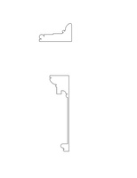
The Port Folio description mentions “guilloche enrichments” on the entablature of the pedestals in the main room. These may have been carved, formed in plaster, or painted. John Haviland’s Walnut Street Theater (1828) and Charles Bullfinch’s Capitol Gatehouses (ca. 1827) both display guilloche ornaments that may be similar to those in the academy, but they are too late to serve as a direct model. Possibly Haviland was familiar with the interior of the academy and drew inspiration from the ornament when designing his theater. It is plausible that, again, the Bank of Pennsylvania was Dorsey’s point of reference, as simple guilloche designs in cast iron flanked the fireplaces in the rotunda, as illustrated by Latrobe (fig. 5).[25] I have used this drawing as the basis for the recreation in the frieze of the pedestals.
3-D Reconstruction of the Exhibition
In the 3-D reconstruction, the works of art are presented to scale and located according to Peale’s sketch of the installation. The frames of Lear and Ophelia are simplified but correctly scaled recreations of Lear’s original frame from the Boydell Shakespeare Gallery, which survives in the collection of the Museum of Fine Arts, Boston (see fig. 29 in the scholarly article). Blender, the platform used to create the 3-D reconstruction, does not permit a detailed reproduction of the carving on the Boydell Gallery frame. For this reason, all of the other frames are also simple gilt rectangles, following period style, though their precise ornamentation remains unknown. The awkwardness of the space for the display of large paintings became apparent during the process of creating a digital reconstruction, and the results are as evident to the modern viewer as they were to Peale and his contemporaries. The two large Shakespeare paintings are placed such that the bottom edges measure five feet off the ground in this digital space, in line with Peale’s intention to hang the works at a height of four to six feet.[26] Peale’s sketch, together with the extant dimensions for the known framed paintings, informed the location of the other paintings in the reconstruction. Paintings noted in Peale’s sketch but not located have been indicated by the use of blank gray rectangles. Likewise, paintings known today only by engraved reproductions—such as Raphael West’s Oliver and Orlando (1798) and Smirke’s Columbiad paintings—are represented in gray to distinguish them from located paintings.
During the 1807 exhibition, Peale installed a green baize curtain to partition the rotunda (denoted at the edges of his sketch and described in his letters).[27] The cloth served to separate the paintings on the western side of the room from the plaster casts that were moved to the eastern side. I have recreated this curtain in the panorama; while Peale referenced the use of “stanchions” to hang the curtain, the specific methods used to drape it are unknown. Receipts for a large table, pedestals, rollers, and wall brackets suggest a substantial investment in gallery furniture for displaying casts and statues. Unfortunately, the arrangement of the eastern half of the room, and the specifics of the furniture involved, remain unknown at present. Interestingly, the brackets and the table were painted green, matching the floor cloth and curtain.[28] As an artist himself, Peale likely had a clear aesthetic vision for the interior of the rotunda, only hinted at through existing documents.
The opportunity to reconstruct this historic exhibition and the building in which it was housed has been both enjoyable and enlightening. As much as it is an investigative exercise, it is also a creative one, guided by specific constraints derived from historic data. Hopefully this visualization of the academy gives readers a more holistic understanding of the exhibition’s effect on its viewers, and of the specific challenges faced by Peale and others in arranging the artworks displayed.
Interactive Peale Sketch by Allan McLeod
The proposal for “West on the Walls: The 1807 Exhibition of the Pennsylvania Academy of the Fine Arts” describes an exciting project of art historical reconstruction, with many questions raised and numerous ways to explore them, all of which stemmed from the Peale sketch. To retain this lively discursive quality for the interactive feature, it seemed right to put the sketch side by side with the process of reconstruction, using layers—from sketch to reconstruction—to show the scholarly steps taken, rather than simply offering an illustration of the conclusion with all the questions answered.
Previously, Omeka and the Neatline plugin had been used for presenting text alongside images; for example it was used in Kimberly Orcutt’s spring 2019 NCAW Digital Art History article, and it looked like the natural choice for the present project.[29] However, while it can show non-map images, Neatline is geared toward showing maps and using images as layers; it needed workarounds that, when first putting together a mock-up, were too cumbersome so early in development. The decision to move most of the text out of the sidebar and into modal windows also made Neatline appear less necessary.
Since OpenSeadragon (OSD) is made for using high-resolution images in conjunction with interactive markers and layers, it was used instead and proved itself to be perfect for fast and flexible development. So much so that an early mock-up of this project came to be the basis of Emma Steinkraus’s autumn 2021 NCAW Digital Art History interactive feature.[30]
Layers were tried in a number of ways, and ultimately the opacity slider was used to show only the paintings over the sketch. Instead of switching between the reconstruction and the sketch using opacity or a comparison slider (for example, Illya Moskvin’s CodePen “Image Comparison Slider for OpenSeadragon”), two synchronized OSD viewers worked best.[31] The code for the synchronization comes from one of Ian Gilman’s (the main developer of OSD) CodePen examples.[32] The two images—the sketch and the reconstruction—were too different for opacity to give a clear view of them simultaneously, and the comparison slider could not show the same part of both images at the same time. However, once the sketch and a 2-D view of the paintings using the same layout as the sketch were synced, the differences and similarities became easier to see.
Since the sidebar is not something OSD provided, there needed to be a way for the “Reset image” button to respond to the visibility of the sidebar and fit the image accordingly. Initially this was done by dynamically setting a right-hand OSD viewport margin. This worked, but did so without animation. One of the benefits of a well-documented and well-maintained open-source library such as OSD is that its code base makes available robust calculations to fill in any coding gaps. The “home” event could therefore be rewritten using code from the OSD “fitBounds” and “getBoundsNoRotateWithMargins” functions:[33]
function boundsWithMargin(bounds, marginRight) {

    let innerSize = layerViewer.viewport.containerSize.x—marginRight;
    let zoomValue = 1.0 / bounds.width; // from _fitBounds
    let factor = innerSize * zoomValue; // from getBounds

    bounds.width += marginRight / factor;
        return bounds;
    }

    layerViewer.viewport.goHome = function () {

    let bounds = layerViewer.viewport.getHomeBounds();

    if (sideBar === false) {
        bounds = boundsWithMargin(bounds, 0);
    } else {
        bounds = boundsWithMargin(bounds, 350);
    }

    layerViewer.viewport.fitBounds(bounds, false);
};
While such custom code gives consistency to the mechanics of the interactive feature, a sidebar with buttons, modal windows, and a menu bar below the images together offer different levels of discursive detail, working toward the lively quality found in the project proposal.
Celebrating the potential of dynamic user interfaces for learning in his essay “Learnable Programming: Designing a Programming System for Understanding Programs,” computer scientist Bret Victor makes the point that “people understand what they can see” and describes a programming environment that allows the learner to, among other things “follow the flow” and “see the state.”[34] In a similar spirit, the interactive sketch of Peale’s exhibition aims to allow the reader to “follow the flow” of the art historical research and see the different “states” of the scholarly analysis.
Notes
[1] “New-Theatre, Mr. Cooper’s Third Night,” Aurora General Advertiser (Philadelphia), December 18, 1807.
[2] Carrie Rebora, “Robert Fulton’s Art Collection,” American Art Journal 22, no. 3 (Autumn 1990): 40–63.
[3] See “In Circulation: John Singleton Copley and Benjamin West in England, France and America,” Paul Mellon Centre for British Art, March 28, 2014, https://www.paul-mellon-centre.ac.uk/.
[4] Lea C. Stephenson, “Kingscote’s Dining Room and the Multisensorial Interior in the Late Nineteenth Century,” Nineteenth-Century Art Worldwide 20, no. 2 (Summer 2021), https://doi.org/10.29411/ncaw.2021.20.2.3.
[5] Lillian B. Miller, Sidney Hart, Toby A. Appel, and David C. Ward, eds., The Selected Papers of Charles Willson Peale and His Family, vols. 1–5 (New Haven, CT: Yale University Press, 1983–2000) (hereafter SP); Lillian B. Miller, ed., The Collected Papers of Charles Willson Peale and His Family (Millwood, NY: KTO Microform, 1980).
[6] Sally Webster and David Schwittek, with Carlo Diego, Cara Jordan, Lauren Ritz, Leonidas Maliokas, Bruce Weber, “A Digital Recreation of the Lenox Library Picture Gallery: A Contribution to the Early History of Public Art Museums in the United States,” Nineteenth-Century Art Worldwide 17, no. 2 (Autumn 2018), https://doi.org/10.29411/ncaw.2018.17.2.22.
[7] Catherine Roach, “Rehanging Reynolds at the British Institution: Methods for Reconstructing Ephemeral Displays,” British Art Studies 4 (November 2016), n.p., https://doi.org/10.17658/issn.2058–5462/issue-04/croach; and Catherine Roach, “‘The Higher Branches’: Genre and Race on Display at the British Institution, London, 1806,” Art History 44, no. 2 (April 2021): 312–40, esp. 314, https://doi.org/10.1111/1467–8365.12558.
[8] On period taste for pendant pictures, see Roach, “Rehanging Reynolds,” n.p.
[9] “The Pennsylvania Academy of the Fine Arts,” Port Folio, June 1, 1809.
[10] “The Pennsylvania Academy of the Fine Arts,” Port Folio, June 1, 1809, 463–64.
[11] I have not rendered the ornament with the eagle crowning the entablature above the entrance to the academy. Speculating on the form, medium, symbolism, and authorship of this sculpture was beyond the scope of this particular project.
[12] For general information on the bank, see Jeffrey A. Cohen and Charles E. Brownell, The Architectural Drawings of Benjamin Henry Latrobe, vol. 1 of The Papers of Benjamin Henry Latrobe. Series II. The Architectural and Engineering Drawings, series ed. Edward C. Carter (New Haven, CT: Yale University Press, 1994), 188–227. William Birch depicted the completed waterworks in his folio of prints, City of Philadelphia (Philadelphia, 1807).
[13] See C. G. Child’s engraving of the academy after George Strickland in Views in Philadelphia and Its Vicinity, from Original Drawings (Philadelphia: Childs, 1827), n.p.
[14] “Civil War Monument, Monument Park, Adrian, Lenawee County, Michigan,” 1965, Survey (photographs, measured drawings, written historical and descriptive data), Historic American Buildings Survey, Library of Congress, Washington, DC. Photograph in the Prints and Photographs Division, Library of Congress, HABS MICH,46-ADRI,1A-, accessed December 1, 2021, https://loc.gov/.
[15] Owen Biddle, The Young Carpenter’s Assistant (Philadelphia, 1815), 16.
[16] Roger W. Moss, “Owen Biddle,” Philadelphia Architects and Buildings, Athenaeum of Philadelphia, accessed December 1, 2021, https://www.philadelphiabuildings.org/.
[17] SP, 2:1045.
[18] SP, 2:1036.
[19] See Cohen and Brownell, Latrobe, 196, on the similarities between the banks designed by Soane and Latrobe. Notably, Soane and Dorsey each included arched vaults that protruded into the semicircular underside of the dome, a feature not included in Latrobe’s design.
[20] SP, 2:1036.
[21] Michael Fazio and Patrick Alexander Snadon, The Domestic Architecture of Benjamin Henry Latrobe (Baltimore, MD: The Johns Hopkins University Press, 2006), 344.
[22] Cohen and Brownell, Latrobe, 197.
[23] Patrick Baty, The Anatomy of Color (London: Thames and Hudson, 2017), 113.
[24] Anne Felicity Woodhouse, “Nicholas Biddle in Europe, 1804–1807,” Pennsylvania Magazine of History and Biography 103, no. 1 (1979): 16.
[25] Cohen and Brownell, Latrobe, 216.
[26] SP, 2:1045.
[27] SP, 2:1045.
[28] On these points, see notes 17 and 82 in the scholarly article.
[29] Omeka, accessed January 18, 2022, https://omeka.org; Neatline, accessed January 18, 2022, https://neatline.org/; Kimberly Orcutt, with Allan McLeod, “Unintended Consequences: The American Art-Union and the Rise of a National Landscape School,” Nineteenth-Century Art Worldwide 18, no. 1 (Spring 2019), https://doi.org/10.29411/ncaw.2019.18.1.14.
[30] Ian Gilman, OpenSeadragon, accessed January 18, 2022, https://openseadragon.github.io/; Emma Steinkraus, with Carey Gibbons and Allan McLeod, “Impossible Garden: A Contemporary Artist’s Digital Engagement with Women Artist-Naturalists of the Long Nineteenth Century and Beyond,” Nineteenth-Century Art Worldwide 20, no. 3 (Autumn 2021), https://doi.org/10.29411/ncaw.2021.20.3.29.
[31] Illya Moskvin, “Image Comparison Slider for OpenSeadragon,” CodePen, accessed January 18, 2022, https://codepen.io/imoskvin/.
[32] Ian Gilman, “OpenSeadragon Synchronized Viewers,” CodePen, accessed January 18, 2022, https://codepen.io/iangilman/.
[33] “Source: openseadragon.js,” Github, accessed January 18, 2022, https://openseadragon.github.io/.
[34] Bret Victor, “Learnable Programming: Designing a Programming System for Understanding Programs,” Dynamicland, September 2012, http://worrydream.com/.