

The browser will either open the file, download it, or display a dialog.
By the second half of the nineteenth century, advertising posters that plastered the streets of London were denounced as one of the evils of modern life. In the article “The Horrors of Street Advertisements,” one writer lamented that “no one can avoid it.… It defaces the streets, and in time must debase the natural sense of colour, and destroy the natural pleasure in design.” For this observer, advertising was “grandiose in its ugliness,” and the advertiser’s only concern was with “bigness, bigness, bigness,” “crudity of colour” and “offensiveness of attitude.”[1] Another commentator added to this criticism with more specific complaints, describing the deficiencies in color, drawing, composition, and the subjects of advertisements in turn. Using adjectives such as garish, hideous, reckless, execrable and horrible, he concluded that advertisers did not aim to appeal to the intellect, but only aimed to attract the public’s attention. As he explained, “it must be large and it must be pictorial, so that he who runs may read.”[2] The articles written by these two anonymous authors demonstrate that by the end of the 1870s a discourse had emerged that blamed advertising, with its brash designs and instantaneous visual appeal, for degrading public taste and transforming city-dwellers into unconscious consumers.
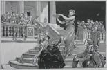
In 1881, the artist Hubert Herkomer began a campaign to reform advertising. At the center of his campaign was an advertising poster promoting the Magazine of Art, a publication launched in 1878. None of the actual posters survive, but the design was reproduced as an engraving in the Magazine of Art in May of 1881 (fig. 1). In the design, a toga-clad goddess descends the steps of a classically-inspired temple, holding a laurel wreath in her hands as she welcomes those who have gathered by her feet. Herkomer’s debt to classical art and Renaissance painting is acknowledged through the presence of art history’s superstars, recognizable to the initiated, crowded behind the temple’s balustrade. Raphael, whose fresco the School of Athens is the poster’s most obvious source, surveys the scene from the left-hand side. The poster covered the hoardings of London at the same time that the Magazine of Art published the design along with an article promoting “The Streets as Art Galleries.”
Herkomer’s poster and the accompanying article exemplified the belief that the streets should be treated as art galleries, and raised questions concerning the relationship between art and pictorial advertising. These same questions were raised once again in 1889, when the soap manufacturer William Hesketh Lever used William Powell Frith’s painting The New Frock as the basis for an advertisement by transforming it into a reproducible image and adding the caption “So Clean,” much to Frith’s displeasure.[3] The discussions that each of these advertisements generated demonstrate the different expectations for art and for advertising, and show that the discomfort with advertising was not simply due to its large size or its garish color, but the mode of viewing it promoted. While we conventionally think of Aesthetic paintings, created “for art’s sake” alone, as the artistic outgrowth of this concern with viewing habits, I will show that this concern was widespread and affected a range of cultural production—including commercial products such as advertisements.
Advertising and the Chances of Art Progress
The apprehension and disapproval that greeted the growth of advertising in the 19th century was just one manifestation of the long-running concern about the state of art and culture in Britain, and more specifically, the effects of urban commercial culture.[4] As people streamed into urban centers from the countryside, purveyors of images and entertainment that were concentrated in cities competed for their attention and their money. Illustrated newspapers, photographs and prints, panoramas and dioramas, and exhibitions of all kinds from the fine arts to “human curiosities” were on offer, and were often promoted through large-scale advertising posters that decorated the city’s streets.[5]
The Royal Academy of Arts, established in 1768 and thus pre-dating the emergence of the illustrated press, photography, and pictorial advertising, can be understood as an early and defensive response to London’s commercial culture. Joshua Reynolds, the Academy’s founding president, made this clear in his annual address of 1780, in which he explained that “trade and its consequential riches must be acknowledged to give the means [in the acquisition of intellectual excellence]; but a people whose whole attention is absorbed in those means, and who forget the end, can aspire but little above the rank of a barbarous nation.”[6] Reynolds’s comment is telling since it associates commerce with the basic instinct for survival that is found in even the most “barbarous” of nations, while suggesting that excellence in intellectual pursuits, the fine arts among them, provides evidence of civility and refinement.
It did not take much work, as we will see, for 19th-century critics to extend this logic to a comparison between the base instincts of the working classes and the refined interests of the upper- and middle-classes. By the second half of the 19th century, the period with which this article is concerned, commentators expressed the fear that Britain’s commercial culture was contributing to the delinquency of the working classes.[7] One proposed solution was to provide access to the fine arts, which would supposedly improve the taste of the working classes.[8] In this way, improved aesthetic taste became a stepping-stone to improved civility and middle-class morality.
Conversely, 19th-century art critics worried that the commercial interests that were infiltrating the fine arts would adulterate the work of art and ultimately damage the aesthetic taste and morality of viewers. A critic’s most scathing remarks often included a comparison between the artist’s work and a commercial product. For example, in 1872, one critic complained that the Academy exhibition “looks like a bazaar or shop for the sale of 'popular’ pictures.”[9] Three years later, John Ruskin compared the Royal Academy exhibition to the mass-produced illustrations of London’s popular journals, suggesting that “Academy work is now nothing more, virtually, than cheap coloured woodcut.”[10] In another context, Ruskin made the connection between cheap woodcuts and the vulgarity of the public, complaining that “the entire illustrative art industry of the modern press” is “enslaved to the ghastly service of catching the last gleams in the glued eyes of the daily more bestial English mob.” For Ruskin, this mob was “capable only of greed for money, lust for food, pride of dress, and the prurient itch of momentary curiosity.”[11] In other words, their vulgarity is the result of their dependence on base instincts, in the absence of the more refined influence of the fine arts.
After the mid-19th century, advertisements became an increasingly commonplace sight within the urban landscape, and pictorial advertisements could certainly be counted among those popular pictures that city dwellers would encounter daily. In 1853, the tax on advertising was abolished, followed in 1855 by the repeal of the newspaper tax. These changes resulted in a growth of the press and a dramatic increase in advertising. According to post office directories, six advertising offices existed in London in 1866. Ten years later, the number had risen almost tenfold, to 56. In 1886, 78 advertising offices were present in London, alongside 76 advertising contractors (a category that had been non-existent twenty years earlier), 144 newspaper and advertisement agents, and one “advertising expert.”[12]
Advertising became a subject of public debate in the 1880s. When Sir William Blake Richmond, Slade Professor at Oxford at the time, weighed in on the topic in October of 1880, he generated a ripple effect of commentary that reverberated throughout the journals of Britain.[13] His remarks on advertising were part of his opening address at the annual congress of the National Association for the Promotion of Social Science. As President of the Art Section, Richmond chose to discuss art “from a social point of view” by considering “the chances of art progress in the United Kingdom.” “Art progress” for Richmond meant the extent to which art had a positive influence on the nation. As he explained, “I would ask whether, taken generally, art, or the love of the beautiful, is getting to have any firmer grip upon the minds and lives of all classes—that is, whether the necessity for being the possessor of a beautiful object rather than an ugly object is gaining ground.”[14]
Richmond’s chief concern was not with the upper classes, to whom art and education were already accessible, or with the middle classes, who were already striving to improve themselves, but with the working classes, who were considered regrettably lacking in the improving influences of art. Richmond and many of his contemporaries believed that an appreciation of art among English laborers would enhance the state of English manufactures, while also providing a “healthful amusement” that could keep the working classes out of the tavern and away from criminal activity. Overlooked in such discussions was the greater concern among the working classes with basic necessities, such as food and shelter, which certainly took precedence over the so-called necessity of possessing beautiful objects.[15] Such omissions allowed Richmond to suggest that the challenges faced by the working classes revolved almost entirely around their lack of taste. He concludes that if “it became generally recognized that our lower classes are capable of aesthetic culture, and that such culture would tend to the progress rather than to the decline and fall of our nation, our country would not be slow to expend a portion of such money upon the taste and moral advancement of the people.” In short, exposure to high art will improve the morals of the working classes by introducing them to pursuits that lie outside their base instincts. Base impulses, including vulgarity and criminality, will be conquered by the more refined feelings promoted through the fine arts.
In addition to highlighting ways that art appreciation might be cultivated, Richmond devoted a large part of his lecture to factors that he considered to impede the progress of art, offering suggestions as to how “the chances of art progress” might be improved. Chief among these impediments were the advertising posters that papered the streets of London. According to Richmond, “their bad and vile Art is lowering to the taste of the very class we are most anxious to elevate, and must leave behind it an indelible injury.”
In response to the problem, Richmond suggested that an inspector of moral tastes be appointed in order to police the streets. Note that he names this imagined position as one that concerns “moral tastes,” rather than the more obvious aesthetic tastes that are under discussion, while eliding any difference between the two. His reasoning regarding the relationship between the aesthetic and the moral is thus taken for granted, and integrated into the proposed solution. In addition, he advised that artists be given a role in advertising, and thereby gave them an important role as moral leaders: “If those who advertise would get the advice of good artists … not only would they profit by the attraction well-designed advertisements would have, but also they would, instead of doing a public harm, as they are now doing by using a powerful weapon in an ostentatious and vulgar way, be public benefactors by disseminating good Art in the most public manner possible.” Instead of impeding the progress of art, and morality by extension, advertising could be harnessed to serve the public good.
“The Streets as Art Galleries”: Herkomer’s Proposal for Advertising
Hubert Herkomer (1849–1914), later known as Sir Hubert von Herkomer, was born in Bavaria. His family emigrated to America in 1851, but returned to Europe shortly thereafter, settling in Southampton, England. Herkomer began attending the Southampton School of Art in 1863, then attended the Munich Academy, and finally enrolled at the South Kensington Schools in London in 1866. Two years later, he began producing illustrations for magazines, and he became a regular contributor to the newspaper the Graphic in 1870. He started exhibiting at the Royal Academy around that time, and achieved his first big success with The Last Muster, a painting exhibited in 1875 that was based on one of his illustrations for the Graphic.[16] Herkomer treated his illustrations for the newspaper as a testing ground for this painting and others he created in the 1870s, experimenting with subjects and compositions before committing them to canvas.[17] In the 1880s, he stopped working for the newspaper,[18] but he continued to paint contemporary and often news-worthy subjects, causing one critic to call one of his paintings “a masterpiece of pictorial-newspaper art.”[19] Herkomer never confined himself just to painting, but was interested in engaging with all aspects of modern visual culture. In the early years of the 20th century, Herkomer would promote the new medium of film as an artistic medium, after having already experimented with theater, music, enamel, lithography, and a new method of printmaking that he invented himself and patented as “the Herkomergravure.”[20] Herkomer’s advertising work further demonstrates his interest in new media and its artistic potential.
In 1881, just a few months after Richmond’s lecture, Herkomer began a campaign to reform advertising posters. At the center of the campaign was a poster Herkomer executed for the Magazine of Art. A copy of Herkomer’s design was published in the May issue of 1881, accompanied by the article “The Streets as Art-Galleries.” The article is anonymous, but a letter of March 1881, written by Herkomer to the journalist George Augustus Sala, suggests that Sala may be the author. In the letter, Herkomer asked Sala to contribute the article and described his motives: “I have preached against [posters], but without effect. But now I have actually done one. It is for the Magazine of Art and its size is eleven feet by seven.… Perhaps this will help to strike at the root of the evil of modern posters.”[21] The evils to which Herkomer refers were described at the start of the article: “Our walls, our railway-stations, every blank space which can be hired – all are utilized for the publications of trade and commerce through the graphic arts.… Those arts are here seen in their utmost degradation. No young barbarism could produce anything so vile, because in savage art there is always something direct, sincere, and germinative. Our street advertising is not un-civilised, it is de-civilised.”[22] Again, we see the suggestion that the influence of trade and commerce leads towards the decline and degradation of art, in this case even sinking below the depths of the so-called barbaric savage.
The article quotes Herkomer at length. Acknowledging that advertisements were necessary, he suggested that they offered “a grand opportunity for displaying art to the populace, for, with the means usually employed, some of the most interesting works of art could be produced.”[23] Referring specifically to the content of Richmond’s lecture, particularly to the proposal that artists be consulted by advertisers, Herkomer stated: “I go much further, and say artists of standing ought to execute these pictorial advertisements themselves. Let a body of artists form a guild, and their productions would soon drive out the present form of hideousness.”[24] At the heart of the article is the conviction that advertising could serve as an “Art for the People,” helping to elevate the taste of “those who have no pictures at home.” As the author explained, “to reach the people, art must step out of the picture gallery, out of the museum, out of the school-room, out of the boudoir, and go into the streets.”[25] According to the article, artistic advertising, if pursued correctly, could reform London’s commercial visual culture and thereby improve the overall culture of the nation.
As explained in the article, Herkomer’s poster portrays the “Genius of Art” in the guise of a classical goddess standing on the steps of a Greek temple that represents the “Temple of Art.” Gathered behind the temple’s balustrade are the masters of all the great schools of art, signifying, according to the article, that “all who would enter the temple must pass their way, mounting by means of their experience, their labours, and their precepts.” In the foreground are those who come to be instructed: the kneeling student, the working man, and the mother with her children. Michelangelo, Correggio, Raphael, Fra Bartolommeo, Titian, Da Vinci, Veronese, Giorgione, Van Eyck, Velasquez, Rubens, Dürer, Van Dyck, Rembrandt, and Reynolds are included as instructors. This line-up of influential figures is reminiscent of Raphael’s treatment of the subject of philosophy in his fresco for the Vatican, the School of Athens (c. 1510–11), in which Plato and Aristotle are surrounded by other leading classical philosophers. Classicism and the High Renaissance, both associated with artistic achievement, are evident as determining influences on the poster’s design. Herkomer’s proposal, as presented in this poster, was not only to put artists in charge of poster design, but also to re-make advertising as a high art by drawing on academic conventions and the rarefied vocabulary of the fine arts.
More than simply altering the appearance of the typical advertisement, with this poster Herkomer proposed a new way of looking at advertising. As the article’s long description of the poster’s iconography suggests, the design could not be understood either immediately or automatically by those lacking knowledge of Old Master paintings and classical conventions, and certainly not by “those who have no pictures at home.” Herkomer had devised a poster that required either knowledge or instruction to aid in its understanding, much like history painting, which stood at the top of the academic hierarchy, and like Raphael’s School of Athens in particular. As a result, the poster would not be readily accessible to the casual or distracted observer. With this poster, Herkomer seemed to aim at slowing down the process of perception rather than speeding it up, and to encourage contemplation and inquiry on the part of viewers.
The automatic recognition that Herkomer attempted to resist with his poster corresponds to a mode of perception that Walter Benjamin described as characteristic of “the age of mechanical reproduction.”[26] In his well-known essay, Benjamin compares two different modes of looking: concentration and distraction. Unlike works of art encountered in ritual settings and examined with concentration, mechanical reproductions such as advertisements are taken in effortlessly as an unexceptional part of everyday life. The way that we use such images is determined not by concentration but by habit, and as a result, our perception of the image, according to Benjamin, “occurs much less through rapt attention than by noticing the object in incidental fashion.”[27] Benjamin calls this “reception in a state of distraction,” and it was this type of reception that Herkomer sought to avoid.
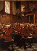
It is noteworthy that Herkomer makes the greatest effort to impede this distracted mode of seeing with the poster for the Magazine of Art, in which he is trying to prove that the advertisement can be elevated to the realm of fine art. Herkomer’s paintings from the same time period seem to strive for the opposite effect. His oil painting titled The Last Muster (fig. 2) is calculated to speed up the process of perception, allowing viewers to take in the scene and respond immediately and automatically. The subject is a gathering of aging and injured veterans at the weekly mass of the Chelsea Hospital. The veteran who sits at the end of the second row has just passed away, and the painting represents the moment when the man to his right discovers his passing. By choosing to portray a contemporary and everyday scene, one in which the soldier dies of old age rather than in heroic battle, Herkomer encouraged his audience to regard the painting as a moment of ordinary life. The view is angled sharply upwards, so that the large windows of the chapel are visible, but does not appear at first glance to be carefully staged. The viewer encounters a sea of heads that are cut off at the edge of the canvas, arranged in the manner of a casual and instantaneous snapshot. Both the subject and the composition suggest a brief glimpse of an ordinary moment, rather than a contrived artistic statement.
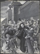
The painting that Herkomer was working on concurrently with the poster for the Magazine of Art shares these same characteristics. Missing, displayed at the Royal Academy exhibition in the summer of 1881, referred to the missing ship Atalanta, which had left Bermuda for Portsmouth on November 7, 1879 and was never heard from again. The painting was eight feet high,[28] and portrayed a crowd of people at the Portsmouth gates. A number of them check the placard on the wall of the gate, looking for familiar names among the list of missing passengers, but the interest of the painting is mostly to be found in the variety of characters and incidents in the scene. Herkomer destroyed the painting in 1895, but his cousin Herman Herkomer had painted a reduced copy in watercolor in 1881, and the copy survives (fig. 3).[29] Like TheLast Muster, the picture is arranged to give the impression of a casual view into everyday life, like the photographic snapshots that would become commonplace within the decade. The action is close to the picture plane, with an all-over approach to the composition that resists offering any point of focus to the viewer. The interlacing of figures results in a dynamic and lively pattern that stretches across the picture plane, to be cut off by the picture’s frame, as though the picture offers only a single glimpse of a larger narrative, chosen from the numerous moments that may have been available. The viewer is encouraged to read the image quickly, as though it might change in an instant.
The composition of Herkomer’s advertisement stands in stark contrast. It is arranged in emulation of Raphael’s School of Athens, with a clear focus on the central figure of the classical goddess. The impression conveyed is not that of a passing moment in time, but a precise, static and significant moment that has been carefully contrived by the artist. The figures will stay in position for as long as is required to unpack the iconography of the picture. Yet that might not have been long enough. The Magazine of Art article that accompanied the design for the poster devoted a great deal of space to explaining the design, suggesting that it was not intended to be readily or immediately accessible. One of the few journalists who commented on the poster made this point, remarking that “we have seen the common multitude look askance at the poster, asking each other what it meant, and the most frequent comment that reached our ears was that the girl was not pretty.”[30] The unfamiliar iconography may have halted the process of consumption, causing the advertisement’s message to be ignored. Herkomer’s treatment of painting and advertising therefore stands in contradiction to our conventional expectations for such media. While his paintings resemble quick sketches, or instantaneous photographs, his advertisements look like classical paintings.
Though few additional responses to Herkomer’s poster survive, his campaign for artistic advertising cannot be interpreted as successful. He was only asked to design one more poster in his lifetime— ten years later. It was for the same patron, Herkomer’s friend Marion Spielmann, who had been the editor of the Magazine of Art. The second poster was for Spielmann’s newest magazine, Black and White, launched in 1891. Once again, the design was classically inspired, and focused on a classical goddess who announces the presence of the new magazine.
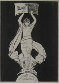
All that survives of the poster is a sketch, which was reproduced alongside Herkomer’s first poster design in Charles Hiatt’s 1895 history of the picture poster (fig. 4).[31] In the pages of Hiatt’s book, Herkomer’s designs are given a quiet and contemplative context. The allegorical figures can be taken in slowly, and the reader is given ample time to reflect on the various meanings that the design holds. The environment in which the actual poster would have been seen was dramatically different. It was pasted on hoardings along the streets of London, where it was surrounded by other posters, sometimes even cut off by those other posters, subject to the noises of the city, and, for the most part, hurried past by distracted city-dwellers. Herkomer was probably not prepared for these changes. In a letter he wrote to Spielmann, he complained about one of these changes, noting that in some cases neighboring posters had been pasted over the bottom of his poster: “I saw several of my posters with a beastly red-lettered advertisement stuck over her feet—thus altering and ruining the look of the whole figure.”[32] The implication of Herkomer's complaint—that “the look” of his figure had been ruined by this change—is that he believed the success of the poster depended on its being seen in a complete and unobstructed manner. Yet the hindrance noted by Herkomer is just one aspect of how the view of the poster could have been obstructed once surrounded by the profusion of advertisements on the city’s hoardings and subjected to the hustle and bustle of the city. A person hurrying past could not always be expected to take in the entirety of Herkomer’s poster at one time, in one quick glance or distracted look. Inevitably, the poster would be seen in bits and pieces, whether due to the intrusion of neighboring posters, or due to the hurried and distracted manner in which it was likely to be viewed.
Appropriating Art for Advertising: Lever, Frith and “So Clean”
Herkomer’s posters may not have had the effect that he envisioned, but it is likely that they still held meaning even for the distracted viewer. The designs may have signified classicism and fine art even to those who did not understand the specific references, thus promoting particular associations for the Magazine of Art and Black and White. The text added onto the design of Herkomer’s first poster announced that the Magazine of Art is “a very storehouse of art,”[33] thus reinforcing the message of the design.
This shows us that the text and image work together to create the meaning of the advertisement. The soap manufacturers Thomas Barratt and William Hesketh Lever were keenly aware of how this worked. In their advertisements for Pears Soap and Sunlight Soap, they combined familiar images with new, unrelated text so that the viewer could digest their messages quickly and efficiently. In 1887, Barratt bought John Everett Millais’s painting Bubbles, along with its copyright, in order to use it as the basis for an advertisement. The painting featured a young boy blowing bubbles. By adding a logo and a bar of soap, Barratt was able to transform the image into an advertisement for Pears Soap. Barratt bought the painting and copyright from Sir William Ingram, the proprietor of the Illustrated London News, who planned to publish a full-color reproduction in the newspaper’s Christmas issue. Thus Barratt was assured, prior to his purchase, of the image’s wide circulation and familiarity. By the time the image appeared as a Pears advertisement, it was already well-known within households across the British Empire. Though Millais’s painting is the most well-known instance of Barratt’s appropriation of art for advertising, it was certainly not the only instance. Works of art purchased by Barratt for the purpose of advertising included Giovanni Focardi’s marble sculpture You Dirty Boy!, which had been on display at the Paris International Exhibition in 1878, and James Hayllar’s Soap Suds of 1887, which Barratt renamed “This is the way we wash our hands.”[34]
A rivalry existed between the two soap masters, and Lever did not want to be outdone by Barratt’s innovative advertising strategies. He described how he and his wife would tour the Academy’s summer exhibition with the very purpose of finding pictures suitable for advertising. In 1887, he purchased George Dunlop Leslie’s painting This is the Way we Wash the Clothes, and turned it into an advertisement by adding the Sunlight Soap logo.[35] Two years later, he considered buying Stanhope Forbes’s Health of the Bride. He described how the painting was “ready” for the purpose of advertising: “Scarcely wants a touch … I should have put a box of Sunlight Soap in the hands of the best man, who is standing up with a glass in his hand drinking health and prosperity to the newly-married couple. The glass would have been replaced by the soap, with the toast, 'Happy is the Bride that Sunlight Soap Shines Upon.’”[36] Forbes’s painting was already promised to Henry Tate, another prominent businessman and collector,[37] and so Lever’s eye fell upon an alternative: William Powell Frith’s The New Frock.
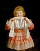
Frith (1818–1909) was an extremely popular Victorian artist, and by 1889 had been a household name for over a quarter of a century. His success was assured in 1858, when a railing had to be erected around his large panoramic painting Derby Day at the Academy exhibition in order to protect it from the crowds it attracted. Frith chose to exhibit his next blockbuster work, The Railway Station (1862), at a commercial gallery and drew 21,150 people into the gallery over the course of seven weeks.[38]The New Frock was smaller than Frith’s earlier panoramas, measuring 92 x 72 centimeters, but it was hung at eye level, on the coveted “line” of the exhibition space, and was therefore sure to attract attention due to both its placement and the artist’s reputation. The painting featured a young girl modeling a new dress, picking up her bleached white pinafore to show off the pink ruffles and white lace (fig. 5). Lever bought the painting directly from Frith without mentioning his intent to use it as an advertisement.[39]
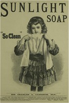
At the time, copyright was included in the purchase of a painting unless specifically excluded,[40] and so Lever became the happy owner of the copyright along with the painting. He added a new caption, “So Clean,” as well as the Sunlight Soap logo, effectively changing the meaning of the picture (fig. 6). It no longer portrayed a young girl’s delight in a new dress, or conveyed the vanitas message that a new dress represented, but demonstrated the power of Sunlight Soap to make the girl’s pinafore brilliantly white. Lever rushed to get the advertisement into press as soon as possible so that it would run concurrently with the exhibition, where the painting was still on display. It was reproduced as a woodcut, appearing in the Illustrated London News and in the Penny Illustrated Paper and Illustrated Times.[41] No specific evidence survives of the advertisement’s appearance as a poster, though this was certainly a possibility.
Frith was outraged by the transformation of his work, though under the laws of the time, the sale of the painting along with its copyright meant that he had relinquished any right to the image. On July 9th of 1889, the Pall Mall Gazette published a letter from Frith to the editor, in which he aired his grievance and warned his “brother artists” to reserve the copyright for their pictures.[42] A lively debate ensued across the correspondence pages of the newspaper. By July 11th, Lever had already responded to the complaint, suggesting that Frith should take pleasure in the advertisement. He explained: “Surely the use of a picture in this way cannot detract from the reputation of the artist, but rather the reverse, because his picture will be admired by and give pleasure to millions who could otherwise never have seen it.”[43]
Contained within this statement is the idea, familiar from Herkomer’s earlier proposal, that advertising could serve as an art of the people. This was an opinion that Barratt of Pears Soap had described in an interview published in the Pall Mall Gazette five years earlier, during which he explained that “advertising is, indeed, a high art.” He elaborated:
A good picture is the best educator in the world. Better than masters, better than lectures, better than preaching. Who can distribute good pictures so well as a large advertiser? He places them on every boarding, at every street corner, in every magazine and periodical, in newspapers, in railway trains, in cabs, in omnibuses – everywhere, in fact, where men do congregate. Given a good picture, done by a good artist, with a good subject, it is always before the eyes of the masses, who see it wherever they go.[44]
A similar conclusion came out of the debate around Frith’s painting. A journalist for the Pall Mall Gazette brought the discussion to a close with the following statement: “The street hoarding is the poor man’s picture gallery, and anything which is done to introduce good art into the posters of ugly London is a clear gain to the community.”[45]
Frith agreed, in principle, with this idea. In an attempt to have the final say in the discussion, he wrote an article on the topic of “Artistic Advertising” for the Magazine of Art, explaining “that Art can, and ought, to lend itself in aid of the advertiser I fully admit, but it must be done in a different way, and with conditions altogether changed.”[46] In the article, he applauded Herkomer’s poster for the Magazine of Art, writing that Herkomer “showed how true Art might be made to serve the advertiser.”[47] But he made a distinction between Herkomer’s approach to combining art with advertising and Lever’s approach, pointing out that Herkomer’s was an original design, created for the purpose of the advertising poster. In contrast, Lever appropriated a painting that was already familiar to the public from its exhibition at the Royal Academy, adding to it with a text and additional meaning that the artist had not intended. According to Frith, the latter strategy hindered the development of artistic advertising, since an advertiser would always prefer to adapt a picture that was already publicly recognizable. As a result, Frith explained, “original designing, however admirable for posters, will find no favour in the eyes of advertisers.”[48]
A familiar and popular picture ensures a more accessible advertisement, one that can be recognized automatically. In contrast to Herkomer’s proposal for the advertising poster, Lever’s strategy aimed at speeding up the perception of the advertisement, with the intended result that the product on offer would be consumed at a similarly accelerated rate. Though Frith deplored this strategy, particularly when it involved one of his own pictures, he undoubtedly understood its logic. While railing against it, he also admitted that Herkomer’s advertisement was “no doubt … over the heads of the ordinary public,” and questioned whether it “in any sense suit[ed] the advertiser.” He also shared “a dreadful thought [that] is borne in upon me; does not the advertiser require a more or less popular picture as the important factor in his advertisements?”[49] For Lever, this thought was welcomed enthusiastically rather than with dread. He consistently chose images that could be recognized at a glance. The advertisement could therefore be digested effortlessly, and casual observers would metamorphose into consumers, with or without their consent.[50]
Aestheticism and Contemplative Looking
These discussions around advertising occurred against the backdrop of profound changes in British artistic culture. Criticism of the Royal Academy exhibition had previously concentrated on the shortage of serious history paintings, an effect of the lack of public patronage and of the supposedly corrupting influence of the marketplace. Towards the end of the 1860s, a new type of criticism began to emerge, which suggested that what was lacking was not seriousness and history, but beauty. Sidney Colvin’s article on “English Painters and Painting in 1867,” published in the Fortnightly Review in October of that year, is acknowledged as among the first of this kind. He began his article in the typical fashion of Academy reviews by lamenting the current state of the arts, writing that “there is much that is discouraging in the position and prospects of painting in England.”[51] Yet his concern was not with history painting or the problem of patronage. Instead, Colvin suggested that what was lacking at the Academy was beauty, and he explained that it is the responsibility of those with “artistic insight” to effect change.
The paintings that came under attack in Colvin’s article are those in which “we have the mimetic faculty occupying itself with more or less picturesque accidents of common existence, the aim of the painter being to illustrate for purposes of amusement or edification.” By drawing on common existence, the painter encourages his audience to read the painting as an instance of everyday life, which requires no more than a distracted mode of seeing. In contrast, the art that Colvin endorsed eschews the subjects of common existence, focusing instead on the “perfection of forms and colours – beauty, in a word.”[52] To identify and isolate these forms and colors requires getting beyond habitual and distracted modes of seeing. It requires slowing down one’s mode of consumption in order to identify elements that would otherwise be passed over.
Colvin is describing the emergence of Aestheticism, an art movement that promoted the doctrine of “art for art’s sake.” Discussions of the Aesthetic movement tend to concentrate on its insistence on creating beautiful forms, independent of meaningful narratives, but I want to emphasize another aspect of Aesthetic principles. Aestheticism was not just a new style of painting, evident in the work of Dante Gabriel Rossetti, Edward Burne-Jones, and James McNeill Whistler, but was also a new mode of viewing. Aesthetes encouraged people to look closely and carefully, in order to move beyond the distracted mode of viewing that was commonplace in an increasingly commercial and industrialized world, and which was tending to transform distracted viewers into unconscious consumers.
Walter Pater’s writings on art serve as an example of this more contemplative and discerning mode of looking. In his study The Renaissance, first published in 1873, he employed a contemplative mode of looking at Leonardo da Vinci’s Mona Lisa (c. 1503–6). One’s distracted looking might suggest that the painting portrays a woman sitting by a window. Yet she becomes so much more when Pater takes the time to muse on the possibilities: “She is older than the rocks among which she sits”; she is “like the vampire, she has been dead many times, and learned the secrets of the grave”; she “has been a diver in deep seas,”; she has “trafficked for strange webs with Eastern merchants”; and she “stand[s] as the embodiment of the old fancy, the symbol of the modern idea.”[53]
In the famous conclusion to The Renaissance, Pater described life as an interval (“we have an interval, and then our place knows us no more”), and explained that “our one chance lies in expanding that interval, in getting as many pulsations as possible into the given time.”[54] In other words, he urged readers to slow down their activities, taking more time to see and contemplate what is before them. The reward for this slow looking is that the interval of life will be more enjoyable, bringing “the highest quality to your moments as they pass, and simply for those moment’s sake.”[55]
Elizabeth Prettejohn has described the Aesthetic movement as a mode of experimentation. The movement's proposal of “art for art’s sake” does not imply a specific intent, but must be interpreted as an open-ended question that challenges conventional views of art. The Aesthetes ask how art might look and function when it is not created for the sake of some other purpose, whether it be a patriotic purpose (as was often the case with history painting), a commercial purpose, or merely the purpose of conveying a narrative. According to Prettejohn, each painting serves as a hypothesis of what art might be; hence the experimental nature of the movement.[56]
Considered in this light, Herkomer’s advertising poster also appears as a proposal of how art might look and function. Herkomer did not create the poster for its own sake, contrary to what is expected of Aesthetic works of art. It serves the purpose of promoting the Magazine of Art. However, he did attempt to replace the distracted mode of looking associated with commercial visual culture with the slow and contemplative looking of Aestheticism. Herkomer was not trying to change art with this proposal, but was trying to change life by transforming the way that people of all classes would interact with their environment. His proposal to re-make London’s streets as an art gallery involved more than just papering the city’s hoardings with replicas of history painting. His model for advertising involved a contemplative mode of viewing that would promote a different way of living, one that encouraged city-dwellers to not only slow down their looking and expand the moments of their lives when confronted with art in the space of an art gallery, but to apply this approach to everyday life as well. For Herkomer, the connection between aesthetic taste and morality hinged on the possibility of a contemplative response. Any image consumed in distraction seemed to Herkomer a waste of the artist’s talents and a missed opportunity, and, furthermore, was evidence of the moral degradation of the viewer.
Throughout his long career, Herkomer applied this belief to his work in a wide range of media, as though his goal was not just to create works of art, but also to prove that any medium could produce a valuable response in viewers. One obituarist suggested as much after Herkomer’s death in 1914, writing that he was “tireless in experiment, but always in the direction of extending the possibilities of this or that medium, never of perfecting it. He regarded, indeed, the public as his material, the instrument on which he played, and he was indifferent to paint or copper, stone or bronze, so long as he produced an effect on the mind of the beholders.”[57]
A craze for artistic poster design finally spread across Europe in the 1890s with the Art Nouveau movement. Posters designed in France by Jules Chéret, Alphonse Mucha, and Henri de Toulouse-Lautrec—among the best known artistic advertisements—were introduced to English audiences through public exhibitions of posters (which, incidentally, brought posters off the streets).[58] The first large-scale exhibition of posters was mounted in 1894 by the collector Edward Bella at the Royal Aquarium in London.[59] Publications from the end of the century acknowledge Herkomer as playing a role in early poster design in England,[60] but his work has been eclipsed by those with a much larger output of posters, including two of his students, James Pryde and William Nicholson (better known as the Beggarstaff Brothers).[61]
It is noteworthy that Lever went on to open an art gallery with the express purpose of improving the lives of his workers. In 1913, Lever founded the Lady Lever Art Gallery and began work on a classically-inspired building to house his art collection. The gallery opened in 1922 in Port Sunlight, the village that Lever had built between 1888 and 1914 to house the employees of his factory. Lever considered both the gallery and the village as a means of giving back to the community, and of enhancing the lives of working-class people. In a lecture delivered in 1915, Lever explained that “art and the beautiful civilize and elevate because they enlighten and ennoble.”[62] The Lady Lever Art Gallery was expected to “civilize and elevate” by providing art to the working classes, echoing Herkomer’s earlier suggestion that advertisements could function as an art of the people in order to elevate the populace. However, this time it would be high art, in an appropriately elevated setting. That this would be the eventual home of The New Frock would have pleased Frith, but the logic behind the Lady Lever Art Gallery went against Herkomer’s high hopes that advertising could serve as an art gallery of the streets.
An early version of this article was presented at the Association of Historians of Nineteenth-Century Art Future Directions session at the CAA conference in February 2011. Special thanks goes to Ann Bermingham, Ann Jensen Adams, Bruce Robertson, Lee Edwards, Maria Gindhart, Petra Chu, and Robert Alvin Adler for their comments and suggestions. Research for this article was completed with the assistance of a Visiting Scholar award from the Yale Center for British Art.
[1] “The Horrors of Street Advertisements,” Saturday Review, November 1, 1879, 532.
[2] “Art in the Streets,” Examiner,September 11, 1880, 1063.
[3] For Frith’s reaction to the advertisement, see W. P. Frith, “Artistic Advertising,” Magazine of Art, December 1889, 421–27.
[4] See John Barrell, Political Theory of Painting from Reynolds to Hazlitt: “The Body of the Public” (New Haven: Yale University Press, 1986); John Barrell, “Benjamin Robert Haydon: The Curtius of the Khyber Pass,” in Painting and the Politics of Culture: New Essays on British Art, 1700–1850, ed. John Barrell (New York: Oxford University Press, 1992), 254–89; Andrew Hemingway, “Art Exhibitions as Leisure-Class Rituals in Early Nineteenth-Century London,” in Towards a Modern Art World, ed. Brian Allen (New Haven: Yale University Press, 1995), 95–108; and Kay Dian Kriz, “French Glitter or English Nature? Representing Englishness in Landscape Painting, c. 1790–1820,” in Art in Bourgeois Society, ed. Andrew Hemingway and William Vaughan (Cambridge: Cambridge University Press, 1998), 63–83.
[5] Here, I am emphasizing the different types of images and visual entertainments that were promoted through advertisements, though there were also plenty of posters featuring food, soap, clothing and other types of products. For an overview of different types of advertisements, see Diana and Geoffrey Hindley, Advertising in Victorian England 1837–1901 (London: Wayland Publishers, 1972). For an analysis of advertisements for soap in the British Empire, see Anne McClintock, “Soft-Soaping Empire: Commodity Racism and Imperial Advertising,” Imperial Leather: Race, Gender and Sexuality in the Colonial Contest (New York and London: Routledge, 1995), 207–31. For more on 19th-century urban entertainments, see Richard Altick, The Shows of London (Cambridge, MA: Belknap Press, 1978); Kate Flint, “The Visible and the Unseen,” in The Victorians and the Visual Imagination, ed. Kate Flint (Cambridge and New York: Cambridge University Press, 2000), 1–39; and Lynda Nead, Victorian Babylon: People, Streets and Images in Nineteenth-Century London (New Haven: Yale University Press, 2000).
[6] Joshua Reynolds, “Discourse IX” (1780), in Discourses on Art, ed. Robert R. Wark (New Haven: Yale University Press, 1975), 169. See also Louise Lippincott, “Expanding on Portraiture: The Market, the Public, and the Hierarchy of Genres in Eighteenth-Century Britain,” in The Consumption of Culture 1600–1900, ed. Ann Bermingham and John Brewer (London and New York: Routledge, 1995), 75–88.
[7] For some examples, see William Blake Richmond, “The National Association for the Promotion of Social Science,” Scotsman, October 13, 1880, 7; John Ruskin, Notes on Some of the Principal Pictures Exhibited in the Rooms of the Royal Academy (London: Ellis and White, 1875); and John Ruskin, Ariadne Florentina (Kent: George Allen, 1876). For a more recent analysis of this phenomenon, see Nead, Victorian Babylon, 2000.
[8] For more information on how the fine arts were expected to improve the taste and morality of the working classes, see Tim Barringer, Men at Work: Art and Labour in Victorian Britain (New Haven: Yale University Press, 2005); Frances Borzello, Civilising Caliban: The Misuse of Art, 1875-1980 (London and New York: Routledge & K. Paul, 1987); and Giles Waterfield, ed., Art for the People: Culture in the Slums of Late Victorian Britain (London: Dulwich Picture Gallery, 1994).
[9] “The Royal Academy,” Athanaeum, May 25, 1872, 657. On the fashionable and commercial character of exhibition spaces, see Hemingway, “Art Exhibitions as Leisure-Class Rituals,” 95–108; and Kriz, “French Glitter or English Nature?,” 63–83.
[10] Ruskin, Principal Pictures, 8.
[11] Ruskin, Ariadne Florentina, 239.
[12] T. R. Nevett, Advertising in Britain: A History (London: Heinemann, 1982), 100.
[13] For examples, see “The Social Science Congress,” Art Journal, November 1880, 349; “Mischievous Effects of Vulgar Wall-Posters,” Chambers’s Journal, December 11, 1880, 799; and “Art and Social Science,” British Architect 14, no. 16, October 15, 1880, 178.
[14] The full text of Richmond’s lecture was published in “The National Association for the Promotion of Social Science,” Scotsman, October 13, 1880, 7. All subsequent quotations of Richmond’s lecture are taken from this source.
[15] For an analysis of these types of omissions and misunderstandings in Victorian philanthropy, see Seth Koven, “The Politics and Erotics of Dirt: Cross-Class Sisterhood in the Slums,” Slumming: Sexual and Social Politics in Victorian London (Princeton and Oxford: Princeton University Press, 2005), 183–227.
[16] Sources that recount Herkomer’s biography include Lee MacCormick Edwards, Herkomer: A Victorian Artist (Aldershot: Ashgate, 1999); Hubert von Herkomer, The Herkomers, 2 vols, (London: Macmillan, 1910–11); A. L. Baldry, Hubert von Herkomer, R.A.: a study and a biography (London: G. Bell and Sons, 1901); and J. Saxon Mills, Life and Letters of Sir Hubert Herkomer (London: Hutchison & Co., 1923).
[17] I discuss Herkomer’s Graphic illustrations “Sunday at Chelsea Hospital” (February 18, 1871) and “Old Age – A Study at the Westminster Union” (April 7, 1877) as experiments leading up to the oil paintings The Last Muster and Eventide: A Scene in the Westminster Union (1878) in my dissertation, “Printing and Painting the News in Victorian London: The Graphic and Social Realism, 1869-1891” (PhD diss., University of California at Santa Barbara, 2010), 179–89.
[18] Herkomer never made an official declaration that he was no longer working for the Graphic, but his illustrations stop appearing in the newspaper at the end of the 1870s, with the exception of a few illustrations for Thomas Hardy’s Tess of the D’Urbervilles in 1891. For a list of Herkomer’s magazine illustrations, see Edwards, Herkomer: A Victorian Artist, 137–38.
[19] “The Royal Academy Exhibition,” Athenaeum, May 28, 1881, 725.
[20] See Edwards, Herkomer: A Victorian Artist, particularly the last three chapters, entitled “Theatre Fantasies and Cinema Experiments,” “Herkomer as Printmaker,” and “The Late Years.” I also discuss Herkomer’s interest in this wide range of media in “Printing and Painting the News in Victorian London,” 204–6.
[21] Hubert Herkomer to George Augustus Sala, March 9, 1881, MS Vault Sala 5, Beinecke Rare Book and Manuscript Library, New Haven.
[22] “The Streets as Art-Galleries,” Magazine of Art, May 1881, 299.
[23] Ibid., 300.
[24] Ibid., 302.
[25] Ibid., 299.
[26] Walter Benjamin, “The Work of Art in the Age of Mechanical Reproduction,” in Illuminations, ed. Hannah Arendt, trans. Harry Zohn (New York: Harcourt, Brace & World, 1968), 217. Other sources that consider the relationship between perception and new media are Jonathan Crary, Techniques of the Observer: On Vision and Modernity in the Nineteenth Century (Cambridge, MA: MIT Press, 2000); Martin Jay, “Chapter Two: Dialectic of EnLIGHTenment,” Downcast Eyes: The Denigration of Vision in Twentieth-century French Thought (Berkeley: University of California Press, 1993); Lynda Nead, The Haunted Gallery: Painting, Photography, Film c. 1900 (New Haven and London: Yale University Press, 2007); and Joel Snyder, “Benjamin on Reproducibility and Aura: A Reading of 'The Work of Art in the Age of its Technical Reproducibility,” Philosophical Forum 15, no. 1-2 (Fall-Winter 1983-84): 130–45.
[27] Benjamin, "Work of Art," 240.
[28] Edwards recorded the size of the original painting as eight feet high based on correspondence between Herkomer and Lewis. Edwards,Herkomer: A Victorian Artist, 78. None of the reviews of the painting mention its size, though one critic described it as representing “life-size groups.” “Notes on Art and Archaeology,” Academy, April 9, 1881, 269.
[29] Herman Herkomer wrote in a letter to his family that he was asked to make “a drawing (large) of Hubert’s Missing. It is to go in the Graphic. He will touch it up to suit himself I suppose.” Herman Herkomer to John Herkomer, March 1, 1882, Platenius Collection, Yale Center for British Art, New Haven. The work that survives is technically a watercolor, but it is not surprising that Herman would call it a drawing. Images created as illustrations for the Graphic were commonly referred to as drawings, since they were usually based on drawings and the resulting engraving looked closer to a drawing than a painting. However, the final version that was submitted to the newspaper for reproduction was always painted in black and white watercolor.
[30] “Notes on Current Events,” British Architect 15, no. 22, June 3, 1881, 278.
[31] Charles Hiatt, Picture Posters: A Short History of the Illustrated Placard (London: G. Bell and Sons, 1895), 193.
[32] Hubert Herkomer to Marion H. Speilmann, February 8, 1891 (no. 16), The Spielmann Collection, John Rylands University Library, Manchester.
[33] “Notes on Current Events,” British Architect, June 3, 1881, 278.
[34] “The Artist and the Advertiser,” Pall Mall Gazette, July 19, 1889; and Edward Morris “Advertising and the Acquisition of Contemporary Art,” Journal of the History of Collections 4, no. 2 (1992): 197.
[35] “The Artist and the Advertiser,” Pall Mall Gazette, July 17, 1889; and Morris “Advertising and the Acquisition of Contemporary Art,” 196.
[36] “Artist and the Advertiser,” July 17, 1889.
[37] Frith, “Artistic Advertising,” 422; and The Tate Collection, “Stanhope Alexander Forbes, The Health of the Bride, 1889,” Tate Online, http://www.tate.org.uk (accessed November 22, 2011).
[38] W. P. Frith, My Autobiography and Reminiscences (New York: Harper & Brothers, Franklin Square, 1888), 234.
[39] Both Frith and Lever explained that Frith was ignorant of Lever’s intentions. Frith wrote about his “surprise” at seeing his painting reproduced as an advertisement in “The Artist and the Advertiser,” Pall Mall Gazette, July 9, 1889. Lever defended his actions in “The Artist and the Advertiser,” Pall Mall Gazette, July 17, 1889, explaining that Frith would have only increased the price of the painting if he had known of Lever’s intentions.
[40] On English copyright laws, see Susan Lambert, The Image Multiplied: Five Centuries of Reproductions of Paintings and Drawings (New York: Arabis Books, 1987), 159–61 and Robert Verhoogt, Art in Reproduction: Nineteenth-Century Prints after Lawrence Alma-Tadema, Jozef Israëls and Ary Scheffer (Amsterdam: Amsterdam University Press, 2007), 153–61.
[41] “Sunlight Soap,” The Penny Illustrated Paper and Illustrated Times, August 10, 1889, 175; September 7, 1889, 235; September 21, 1889, 267; January 11, 1890, 27; “Sunlight Soap,” Illustrated London News, July 20, 1889, 97; August 17, 1889, 221; August 31, 1889, 285; September 14, 1889, 353; September 28, 1889, 415; December 21, 1889, 811; April 5, 1890, 442.
[42] “Artist and the Advertiser,” July 9, 1889.
[43] “The Artist and the Advertiser,” Pall Mall Gazette, July 11, 1889.
[44] “The Great Advertisers of the World,” Pall Mall Gazette, June 14, 1884, 20.
[45] “The Artists and the Advertiser,” Pall Mall Gazette, July 19, 1889.
[46] W. P. Frith, “Artistic Advertising,” 421.
[47] Ibid., 422.
[48] Ibid.
[49] Ibid.
[50] Lynda Nead also discusses this phenomenon in Victorian Babylon, 153.
[51] Sidney Colvin, “English Painters and Painting in 1867,” Fortnightly Review,October 1867, 464.
[52] Ibid., 465–66.
[53] Walter Pater, The Renaissance (London and New York: Macmillan and Co., 1888), 130.
[54] Ibid., 251–52.
[55] Ibid.
[56] Elizabeth Prettejohn, Art for Art’s Sake (New Haven: Yale University Press, 2007).
[57] “Sir H. von Herkomer,” Athenaeum, April 4, 1914, 501.
[58] Margaret Timmers, ed., The Power of the Poster (London: Victoria and Albert Publications, 1998), 40–41.
[59] Edward Bella, ed., A Collection of Posters: The Illustrated Catalogue of the First Exhibition (London: Royal Aquarium, 1894).
[60] Ibid., 27 and Hiatt, Picture Posters, 186.
[61] Timmers, Power of the Poster, 42.
[62] Edward Morris, “Paintings and Sculpture,” Lord Leverhulme: Founder of the Lady Lever Art Gallery and Port Sunlight on Merseyside, A Great Edwardian Collector and Builder, exh. cat. (London: Royal Academy of Arts, 1980), 32.
