

The browser will either open the file, download it, or display a dialog.
Henri Rivière: Entre impressionnisme et japonisme
Bibliothèque nationale de France Exhibition dates : April 7-July 5, 2009
Exhibition catalogue:
Henri Rivière, Entre impressionnisme et japonisme
Under the direction of Valérie Sueur-Hermel, with contributions by Bruno Racine, Jocelyn Bouquillard, Philippe Le Stum, Catherine Méneux, and Monique Moulène.
Paris: Bibliothèque nationale de France, 2009.
223 pages; 205 color illus; bibliography; index; glossary of printing terms.
€39
ISBN: 978-2-7177-2431-8
Henri Rivière's name has floated on the periphery of nineteenth century French art history studies since the late nineteenth century. He is not easy to categorize as either "impressionist" or "Pont-Aven School", or even "modern" as his approach to both flatness and popular art might suggest. His prints have long been admired by a small public for their Breton subjects and beautiful colors, and by print connoisseurs for their technical mastery. The story is more complex and deserves a major review.
In 2006, the Bibliothèque Nationale de France in Paris (the BNF) acquired the entire Rivière studio contents. This included the artist's personal collection as well as a collection of Japanese art consisting of 850 prints and 73 illustrated books, sketchbooks, preparatory drawings, various states of his prints, and hundreds of watercolors. Added to the BNF's already large collection of 5,000 Rivière works, the curator of this superb exhibition, Valérie Sueur-Hermel, was able to choose over 200 works to present an insightful exploration of the artist's creative process, which should help restore the high standing he had in the French art world at the end of the nineteenth century.[1] As the title of the exhibition suggests, Sueur-Hermel's approach explores both the artist's passion for the impressionist concerns of light and changing weather, and the profound influence exerted by his discovery and subsequent passionate collecting of Japanese prints and objects. This places Henri Rivière's work, at least in the curator's eyes, well into the tradition of late nineteenth- century impressionist art.
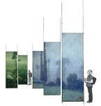
Installing an exhibition of works that rely on such modern concepts as flat planes, abstracted forms and the subtle play of light and shadow suggested through color, in an over-the-top baroque exhibition room in the rue de Richelieu building of the BNF must have been a demanding challenge. An imaginative choice of tall panels painted in soft, cool colors, and well-placed banners containing pixilated details of some of Rivière's images, counteract the colorful and gilded excesses of the surroundings and present an environment that invites the use of contemporary vocabulary (fig. 1). Computer and video screens, a grainy, but touchingly intimate movie of the artist working on-site, and the striking placement of a reconstructed "shadow play" décor in the first room of the exhibition all set the stage for this fine overview of the artist's oeuvre.[2]
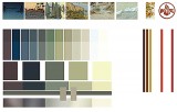
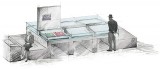
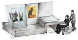
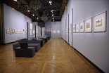
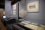
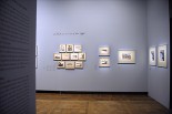
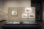
In fact, the allusion to a "stage" is an accurate description of the approach to the exhibition's installation. Recent museum installations seem to fall more and more to professionals outside of the curatorial field. For the BNF Rivière exhibition, a competition was held and the studio of Philippe Maffre was chosen. An architect by training, and exhibition designer for the past 25 years for the Louvre, Institut du Monde Arabe and other French museums, Maffre promised a low-budget installation that would use the resources of the BNF (frames, glass display cases, etc.), but with contemporary elements. One of his most effective contributions to the beauty of the exhibition is his choice of colors (fig. 2). Following the color scheme of each period in Rivière's development, from the dark early Chat Noir period works to the lighter watercolors of his late career, Maffre and his team chose cool violets, blues, greens and ecru—colors that flow soothingly from beginning to end, dark to light. Not wanting to totally mask the room's original excesses of flowers, pastoral scenes and gilded stucco, however, they decided to leave visible the swags of flowers and painted trompe l'oeil balconies in the widely spaced wall niches in each room. One of their most original ideas was to paint many of the frames of Rivière's prints the same colors as the walls, allowing the frames to melt into the surrounding support, focusing attention on the work of art itself and not on its presentation. They also used the colors of the frames to differentiate prints (painted the color of the wall) from drawings (unpainted pine) and watercolors (darker oak frames with rounded edges). Glass display cases and freestanding walls in the center of the exhibition allow the curators to display fragile sketchbooks, small preparatory drawings and early states of a print at waist level, with the final version of the print hung above (fig. 3). In some cases, however, the completed print is on a wall behind, making it difficult to compare details. One final challenge for the designers is the fact that there is only one entry/exit for the exhibition, so viewers must retrace their steps to exit. This problem is solved by the two-sided kakemono banners and well-placed computer screens and wall texts that keep the visitor interested on the way out (fig. 4).[3]
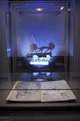
Beginning the exhibition with a reconstructed shadow play, using some of the original zinc figures, illustrates the vocabulary for understanding Rivière's future works in printmaking: flat planes of color and a preoccupation with light as expressed through color, or, conversely, color expressed through light (fig. 5). The cut out zinc figures, lit from the front, cast shadows on flat screens of color behind them. These papers are alternately superimposed to suggest different times of day, locations, or moods. As his technique evolved, the artist used colored lights to create the effects of a setting sun, dissipating fog, or even the ebb and flow of waves on the sea. These interventions entranced the enthusiastic avant-garde patrons of the Rudolph Salis's Paris cabaret, Le Chat Noir, where Rivière worked from 1882-1896.
Another effective addition to the beginning of the exhibition is a video showing of L'Enfant prodigue, first produced at the Chat Noir in 1894, which demonstrates how the addition and subtraction of printed images behind the zinc figures bring the illustrated story to life. It is an early step towards animation. Georges Fragerolle's operatic poem and music, heard on headphones, accompanies the seven biblical scenes. "Stills" or individual prints from the production hang nearby, and the book of the musical score is in a vitrine.
Rivière's early prints, mainly etchings, were heavily influenced by the printmaker, Félix Buhot, as swirling aquatint and etched lines suggest wind, driving rain and other weather effects (ex. cat. figs. 3-8). The splotchy aquatint suggests these are early experiments, but the webs of etched lines and the fugitive subject matter point to the future. It was Rivière's rapid absorption of the lessons of Japanese prints that coincided with his discovery of the landscape, light, and colors of Brittany that established his reputation. Jocelyn Bouquillard's catalogue essay on Henri Rivière, un graveur à l'âme japonisante succinctly weaves the well-known events of the discovery of Japanese art in Paris artistic and decorating circles with Rivière's particular experiences. In her article on the artist's personal collection, Henri Rivière, collectionneur et éditeur d’art, Monique Moulène reinforces the importance all things Japanese held for the artist as he acquired hundreds of prints, ceramics and other objects. The artist's collection was so extensive that the famous dealer, Hayashi, gave Rivière first choice of his new imports in exchange for the decorative panels the artist did for his home in Tokyo (51).
It was in Brittany, where Rivière summered from 1885 to 1915, that he had the time, the focus, and the environmental stimuli to produce the work for which he is most famous, La Mer, études de vagues, a series of seven color woodcuts executed from1890 to 1892 and in 1914 (ex. cat. figs. 28-34), and Paysages bretons a series of forty-four color woodcuts made from 1890 to 1894 and in 1914 (ex. cat. figs. 40-66). The BNF exhibition effectively juxtaposes some of the Japanese prints from the artist's own collection with the prints they influenced, such as Hokusai's Great wave (ex. cat. fig. 35) and Hiroshige's Mishima, morning fog (ex. cat. fig. 55). The exhibition's installation cleverly intersperses Japanese prints among Rivière's own works by placing the former on flat pilasters jutting only a few inches out from the wall; this not only sets the Japanese prints apart from Rivière's work (a distinction that might be necessary to all but a trained eye in some cases), but also interrupts the often dreary horizontal alignment of many print exhibitions (fig. 6).
The fourteen watercolors entitled Le Boqueteau à Loguivy: étude de lumière of c. 1898 (ex. cat. fig. 77) are tightly grouped so that the viewer can easily appreciate his Monet and Japanese print-inspired approach to the study of weather and lighting effects on one object. The group of pines, as seen from Rivière's bedroom window (109) was first drawn as a lithograph. Fourteen were printed in pale grey, serving as matrices for the ambitious study of different conditions that were rendered in watercolor. They are hauntingly beautiful.
Rivière's color woodcuts brought him fame in the late nineteenth century. He had never learned the technical requirements for making woodcuts, nor was he in possession of any of the tools used by the Japanese woodcut masters he admired. As a result, he used his own technical genius to "invent" them all over again. The Japanese printmakers had used water-based inks, which allowed the colors to soak into the paper and achieve rich color effects. Rivière used the same, and even mastered the rainbow rolls of the Japanese masters. He used pear wood blocks, and the gamut of colors he chose often required that he carve up to twelve blocks for each print. An edition of twenty impressions, for example, might demand printing 240 times, a feat not only of endurance since he printed them by hand, not using a press (27), but also of skill in the registration of each image printed on top of the black or grey matrix.[4] For his Pardon of Sainte-Anne-la-Palud (ex. cat. fig. 58), which used five different sheets placed side-by-side to create the whole image, the artist spent four months carving fifty woodblocks and then two more months to print (37). The exhibition, in many cases, is able to show the color separation blocks, as well as preparatory drawings (fig. 7).
While collectors and print dealers marveled at Rivière's technical proficiency, critics complained because the limited editions of woodcuts could only be enjoyed by a few collectors. Woodblocks crack and wear out after a certain amount of usage. Lithography, on the other hand, could serve the same artistic effect, and can be printed in editions of thousands (16). When he returned to Breton themes in his Beau pays de Bretagne made in 1898 and 1914 (ex. cat. figs. 138-150), Rivière printed the twenty images as color lithographs. Six hundred were printed on individual sheets and 1,000 printed as calendars by Eugène Verneau.
For all of his lithographs except one, Rivière turned to Verneau.[5] It was a productive partnership, as the artist participated in each step of the process. For example, he drew his images right onto the stone, in reverse from the original sketch or watercolor, rather than using transfer paper. He inked the stones himself, and even invented new colors, such as the "lilas gris, gris bleu vert and vert jaune" that so characterize his images (19).[6]
Rivière's approach to the subject of Brittany is one of the areas that mark him as a nineteenth-century artist of the Romantic tradition. His Breton images focus on the often dramatic, constantly changing weather effects of the seacoast areas and the light long praised by artists for its alternating brilliant sharpness and soft grey tonal subtleties. When people are depicted, they are often faceless peasants engaged in such timeless rural tasks as watching their animals, doing laundry or fishing. Like many other nineteenth-century European and American artists, Rivière was also intrigued by local Catholic rituals such as the annual "pardon", depicted in the five panels of Le Pardon de Sainte-Anne-la Palud (ex. cat. fig. 58). Here the faces are blank and undifferentiated, and except for the few small figures of handicapped beggars, there is no hint of the poverty and misery that actually plagued their daily lives. Only in rare exceptions, such as the unfinished La Baie des Trépassés, with its drowned sailors on the beach (ex. cat. figs. 69-71), does Rivière suggest the hardships of the fishermen and the violence of the storms that also characterize the region. More often, he depicted the typically idyllic view of Brittany shared by scores of nineteenth-century artists including Jules Breton, Robert Wylie and even the early work of Paul Gauguin and Paul Sérusier.
Since his own photographs are known to have played a role in Rivière's creative process, these photographs would have been an interesting part of the BNF's exhibition, especially when discussing the "Eiffel Tower" lithographs of 1902.[7] This project began in 1889 with three woodcuts; a series of thirty-six images was intended. But again, the technical complexity of cutting the intricate lines of the tower and views of Paris into woodblocks proved too time-consuming. Rivière set the project aside until 1902 when he produced it as an edition of 500 lithographs. In these, the Eiffel tower itself sometimes dominates the scene, and at other times, it is only a small shape jutting into the sky beyond the gargoyles of Notre Dame (De Notre Dame, ex. cat. fig.105), or beyond a dreary wind-swept street (De la rue Lamarck, ex. cat. fig 106) in the distance. The BNF's daring hanging of twelve of the prints into an irregular stack is very effective as the closeness of the images emphasizes the bold angles and startling compositions (fig. 8). These owe much to Japanese prints including the title: 36 views de la Tour Eiffel. Influenced by the Ukiyo-e prints' focus on weather effects, the artist successfully used a gamut of unusual, subtle colors of mustard yellow, and light and dark grey, with a major role also played by the cream colored paper. The BNF's catalogue might have explored the source of Rivière's unusual color combinations in his prints. The Eiffel Tower images were intended to be bound, as shown in a nearby glass case. Was it just coincidental that the Hôtel de Ville in Paris held an exhibit at the same time as the BNF's Rivière show that focused on the technical achievements of Gustave Eiffel, which included many images of the tower under construction?
The second to last exhibition room at the BNF explores how Rivière was caught up in the late nineteenth century concern that art should become more available to the "masses" and less elitist. He responded by making large format lithographs destined to decorate the walls of classrooms or interior public spaces, as well as calendars (ex. cat. figs. 113, 138-150) and posters (ex. cat. fig. 118). Catherine Ménaux's chapter on this aspect of his career, Henri Rivière ou le «Puvis de Chavannes du foyer», gives the artist the intriguing title of "le Puvis de Chavannes du foyer" (41). One could imagine these beautifully colored images, usually printed in editions of one to two thousand, instructing students about atmospheric effects (ex. cat. figs. 126-136) or scenes of the capital, Paris (ex. cat. figs. 121-125). The colors are soothing, the images simple.
In 1913, Henri Rivière's career took a major turn when he traveled to Italy. The final room in the BNF's exhibition is dedicated to these post 1913 works. A beautifully rendered drawing in pencil on blue paper (ex. cat. fig. 257) of the Basilica of Assisi, for example, shows his attention to rendering in great detail the trees, bushes, and architecture of the church. True to his love of exploring the possibilities of different techniques, he then printed it (in reverse this time) as both an etching and a color woodcut (ex. cat. figs. 156, 158-160, fig. 9). It is a shame that this was his last print. Unfortunately, none of the catalogue authors offer any explanations as to why he stopped printmaking. From then on, he devoted himself to traveling and making stunningly detailed watercolors and drawings of the places he visited, and of his home, Paris. One unfinished watercolor of 1912 (ex. cat. fig. 185) shows that a fine pencil study was first laid down, with great attention paid to the outlines of the trees and landscape elements. The watercolor was then filled inside the lines. Rivière suffered a severe ocular hemorrhage in the 1940s and his eyesight declined until his death in 1951.
The greatest contribution of the BNF exhibition is that it allows Rivière's working method to be fully appreciated. It is fascinating to watch the artist move from initial on-site pencil drawings or watercolors to more defined sketches, and then on to the various stages of making the prints. All of the steps are illustrated with examples from the BNF's newly augmented Rivière collection. This helps the public understand the complexity of printmaking. More technical information on the labels themselves, however, might help the viewer appreciate the artist's masterful and meticulous control of every moment in the creation of his images. For the specialist, this exhibition is an eye-opening look not only into the work, but also its development, as well as Rivière's reliance on watercolor throughout his entire career. Philippe Maffre's installation is also to be highly commended for its clean, cool spaces, imaginative hanging, and instructive support material. A future exhibition might also include the artists who influenced Rivière, such as Buhot, as well as the artists in his Chat Noir circle.[8]
Dr. Caroline Boyle-Turner
c.boyleturner[at]gmail.com
[1] Acquired from the artist in 1954.
[2] Made by Rivière's friend, André Noufflard.
[3] Information on the exhibition design and installation from Philippe Maffre via telephone interview, July 2009.
[4] In a color print, a different woodblock, plate, or stone is needed for each color. These are then printed successively onto the same piece of paper, with careful attention paid to lining them up perfectly, called "registration".
[5] Rivière's lithograph for the 4th album of L'Estampe originale, La Vague, was printed by Édouard Ancourt, who printed all of the lithographs for this publication.
[6] Lilac grey, grey blue green, and yellow green.
[7] Les Dossiers du Musée d'Orsay, Henri Rivière graveur et photographe, Musée d'Orsay. Paris: Éditions de la Réunion des musées nationaux, 1988. It may be that none of these photographs are in the BNF's collection, from which all of the images in this exhibition are drawn.
[8] The author would like to thank Dr. Jane Glaubinger, Curator of Prints at the Cleveland Museum of Art for her suggestions and careful reading of this text.
