

The browser will either open the file, download it, or display a dialog.
Jan Toorop
Gemeentemuseum Den Haag, The Hague, The Netherlands
February 27, 2016–May 29, 2016
Villa Stuck, Munich
October 27, 2016–January 29, 2017
Museum Bröhan, Berlin
February 15–May 15, 2017
Catalogue:
Jan Toorop: Zang der tijden (Jan Toorop: Songs of Our Times).
Gerard van Wezel, edited by Paul van den Akker and Hans Janssen.
The Hague: Gemeentemuseum; Zwolle: WBOOKS, 2016.
280 pp.; 475 color illus.
€ 29.95 (hardcover Dutch edition)
ISBN 9789462581319

[The Dutch-language exhibition catalogue will also appear in English and German translation and is the first part of a three-volume English-language catalogue raisonné, the other two parts of which will appear in 2017–2018.]
The aim of the exhibition Jan Toorop is clear: The exhibition organizers want to give the artist Jan Toorop (1858, Jawa Tengah, Indonesia–1928, The Hague, Netherlands) the recognition they believe he deserves, namely as an artist ranking alongside Vincent van Gogh and Piet Mondrian as one of the most important Dutch artists of the period around 1900. This ambitious retrospective exhibition shows Toorop’s entire artistic career; every development is shown in representative groups, each with its highlights. Because of the prestige of the project and its well-researched concept, many artworks that have not been on public display for decades are now exhibited. It was put together by Toorop expert Gerard van Wezel who has dedicated his working life of the last four (!) decades to the research of the artist’s vast and complex body of work.[1]
Toorop was a celebrated artist during his lifetime, exhibiting often throughout Europe, and maintaining good relations with the press. Closely connected to the European avant-garde as he was, Toorop was always well aware of the latest cultural developments and quickly adapted to new styles and genres. In turn, his influence reached far beyond regional borders. He often played an important role in the organization of exhibitions and bringing people together. This monographic exhibition is devoted to Toorop “the artist” and focuses solely on his art; no works by other artists are included. The exhibition organizers’ aim of (re)assessing Toorop’s true artistic value is an appropriate point of departure. A previous exhibition Toorop in Vienna, Inspiring Klimt (Gemeentemuseum, October 7, 2006–January 7, 2007) already visualized the artist’s relation to fin-de-siècle Vienna.[2] A further exploration of Toorop’s role as a key figure in the cultural networks of fin-de-siècle Europe, as well as his influence on others, would make for an interesting exhibition in itself.
As Ronald de Leeuw, former director of both the Rijksmuseum and the Van Gogh Museum in Amsterdam, put it in his opening speech to the exhibition, Toorop was a master of all weapons, not restricted to one particular genre. The fact that Toorop was at ease with so many different artistic styles is a fascinating trait of the artist, but it might also leave one with the impression that he was an artist that trimmed his sails according to the wind. This is a notion that Van Wezel strongly wishes to correct. For Toorop, style and technique were instrumental to the message and therefore every artistic approach was permitted. This message was clear, for his work was always motivated by the same conviction, namely that life is “a painful struggle between antitheses of every kind” as the introductory label to the exhibition proclaimed. Regardless of the different visual languages Toorop adopted in accordance with the quick succession of avant-garde styles, he never ceased to give expression to this key theme. According to the renowned architect H.P. Berlage, Toorop had the ability “to make visible the universal in the personal” (9). It is this primary quality that transcends all the different stylistic phases of Toorop’s artistic career, ranging from the Realism of Gustave Courbet to a very personal use of Art Nouveau, and from the Divisionism of Georges Seurat to Berlage’s ideal of the communal total work of art.
The sequence of stylistic changes is referred to by Van Wezel as “Songs of Our Times,” referencing the title of one of Toorop’s works which was also used as the title of the exhibition catalogue; a mark of honor to the artist’s diversity (10). The substantial Dutch-language exhibition catalogue will also appear in English and German translation and is actually the first part of a three-volume English-language catalogue raisonné, the other two parts of which will appear in 2017–2018. The catalogue is divided in five more or less chronological chapters entitled “Modern Life,” “The New, Mystical Life,” “The Sea,” “Labor and Faith,” and “Figuration and Geometry.” These are followed by shorter sections on Toorop’s portraits, his creative process, and his frames. Furthermore, the storyline is interrupted now and then by short sections highlighting specific subjects such as Toorop’s art education, early collectors, or a design for an art nouveau shop window.
The catalogue is full of newly discovered information, and clearly the work of a well-informed scholar. As such, it is an invaluable must-have for any future research on Toorop. The focal point of the catalogue is Toorop’s critical reception by the contemporary press; it also provides great detail on dates, titles, and exhibition histories, which makes it somewhat too scholarly for the purpose of an exhibition catalogue. Perhaps some of this extensive information would be better placed in the entries of the forthcoming catalogue raisonné. Yet, it serves as the introductory volume of Toorop’s catalogue raisonné for which such an in-depth approach is definitely justified.
Van Wezel’s greatest scholarly contribution was to straighten out the chronology of Toorop’s oeuvre. The author has made a tremendous effort to verify, adjust, and correct Toorop’s oeuvre, regardless of the medium, from painting to mirror frame. This is an extremely complex matter given Toorop’s belief that the process of creation was simply more important than the fixed end result. It was not at all unusual for him to update works at a later date, to reuse subjects, to antedate works, or to date works as they left his studio. In this exhibition and the accompanying catalogue, Van Wezel corrects the misunderstanding that Toorop worked in different styles all the time. The many different developments can in fact be grouped chronologically. Van Wezel’s connoisseurship resulted in a stylistic chronological rearranging of the artist’s oeuvre. This deserves much praise.
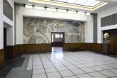
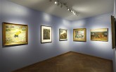
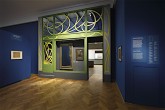
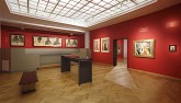
The Gemeentemuseum has a long tradition of Toorop exhibitions, starting with a grand overview exhibition in 1940.[3] The museum’s stunning design (1931–35) by renowned architect Hendrik Petrus Berlage (1856–1934) is the perfect setting for a retrospective exhibition on Jan Toorop (fig. 1).[4] The two were contemporaries and shared their views on monumental art. They actually cooperated closely on Berlage’s trading hall, the famous Beurs van Berlage, for which Toorop designed a range of tile pictures (see fig. 23 below).
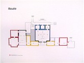
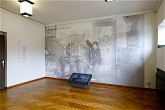
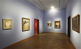
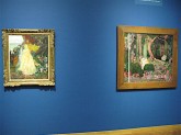
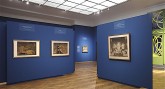
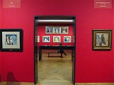
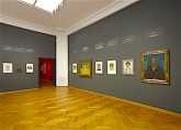
Berlage’s design consists of a large sequence of fairly small rooms and cabinets alternated by a few larger exhibition rooms (fig. 2). The organization of the exhibition follows that of the catalogue, although the five main themes are subdivided into smaller sections. Firstly, one enters a space without art where one can read an elaborate biography of Toorop and an account of his career in an off-putting small type size. More appealing are the two blowups of photographs of the artist in his studio (fig. 3). The introduction label summarizes the aim of the exhibition, impressing upon the visitor that Toorop is to be considered as one of the few Dutch artists who really mattered in the international art world of his time.
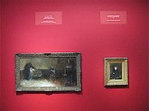
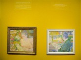
In Toorop’s early career, modern life lies at the core of his artistic production. This is the subject of the first two exhibition rooms. The poverty of modern society and its contrast to rural life were of particular interest to the artist. Initially, it was French Naturalism that fascinated Toorop the most, his role model being Gustave Courbet whose work he studied during his stays in Paris in 1882 and 1884. L’Enterrement (The Funeral) (1883) bears testimony to this (fig. 4). Toorop also greatly admired Dutch artist Josef Israëls, whose influence clearly shows in the artist’s rendering of The Sick Little Child (1884) (fig. 5). In his early years Toorop experimented with different styles to find his own means of expression. For example, after meeting James McNeill Whistler in London in 1885, he executed a variety of ladies dressed in Whistlerian white gowns in intimate interiors (fig. 6).
A new feature in exhibition design that was also noticeable in the exhibition Munch : Van Gogh at the Van Gogh Museum (September 25, 2015–January 17, 2016), is the placement of labels above the art works (see fig. 5). This works well as the labels feature large size type and are placed high enough not to distract the viewer. And it is especially convenient in crowded exhibition rooms where visitors no longer have to take turns reading the small label next to an artwork, often obstructing the view of others.
In 1888, Toorop began to work in a pointillist style inspired by Seurat, whose work was exhibited at the 1887 exhibition of Les XX; Toorop was an active member since 1884. This resulted in paintings like Au Nes (1889) and A Dying (1888) (fig. 7). This refreshing change in style was Toorop’s answer to the critical judgement of the press that had deemed his exhibited works of the previous year not to be original (15). This is but one occasion that demonstrates just how closely intertwined Toorop’s artistic practice was with contemporary critical reception. Especially from 1891 onward, as Toorop came to be considered the most important Dutch avant-garde artist, his work would always be the subject of scrupulous assessment. Exhibitions and their critical reception are very decisive for an artist, typically the determinants of an artist’s reputation.[5] Toorop could always count on a polemic between equally fierce supporters and opponents. Not only was Toorop influenced by the way he was received by the art world, but also he would in turn steer critical opinion by asking critics to discuss certain works, and by responding extensively to reviews.
Toorop’s depictions of peasant life became increasingly infused with a deeper spiritual meaning. This distinguished the artist from typical Dutch Realism. According to critical opinion, Toorop grew into his own in 1891 with the work in watercolor and pencil entitled Melancholy (fig. 8). Although the subject of a peasant woman on her doorstep is reminiscent of the work of Josef Israëls, it was executed in a non-realistic style that has a sense of impassioned mystery (12). In his series of works devoted to the depiction of fisher folk from the village of Katwijk, Toorop sought to imbue his subjects with symbolic significance. The decorative use of flat areas of color as seen in Flood is derived from the work of Gauguin, Japanese art, and modern printmaking (fig. 9).
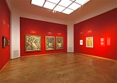
The large middle room forms the center of the exhibition. It is an absolute treasure trove, containing the works for which Toorop is most celebrated. Van Wezel has specified this prime phase of Toorop’s career as “The New, Mystical Life.” In the 1890’s it was all important to be new. Just like the powerful nations that were locked in a rat race for progress that seemed to know no end, modern artists were constantly competing for renewal. Innovation had become the number one criterion for appreciation.[6] Toorop too strived to constantly renew himself. In 1891 he presented a range of new works executed in the symbolist style. These works can be seen as poems in paint, mystical images that bring to mind Wagnerian tales. Today’s viewer might regard Une Génération nouvelle (The Young Generation) (1892) as rather unappealing with its ominous green and blaring pink. At the time it was first exhibited however, its “bright and splashing colors” were compared to Persian embroidery and were believed to actually enhance the expressive quality of the work (fig. 10) (57).
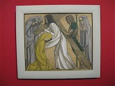
A key work here is The Three Brides of 1892 (fig. 11). It depicts an earthly bride, nude apart from her veil, flanked by a heavenly bride and a hetaere (courtesan). Toorop now worked in a highly authentic linear style with which he intended to speak directly to the human soul. As one of the exhibition labels explains, Toorop was in search of an art that would represent a spiritual reality rather than external life. Images and forms were regarded as symbols; abstractions of a universal, spiritual reality.
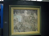
Many contemporary critics have claimed that it is difficult, if not impossible, to describe Toorop’s work (71). As a reviewer for this issue of NCAW, I could not agree more. His work is full of secrets as it were. Putting words to the images will most likely only result in the transposition of Toorop’s linear impressions teeming with symbolic meaning, ranging from sensuous to profoundly devout, into verbal riddles. Some critics claim that one should not try at all, and strikingly enough, Van Wezel too has taken this advice to heart and largely refrains from giving his own descriptions of Toorop’s work. Toorop himself got tired of having to explain his symbolist works and thought it ridiculous to put words to the emotions he conveyed in his art (77). It is probably best to proceed as a critic of the Berliner Tageblatt suggested in 1893: “The viewer will become confused and at the same time urged to penetrate the labyrinth of the imagination.”[7] What one can and must say about Toorop’s elaborate drawings is that each section on its own deserves the viewer’s attention. One can marvel in the extraordinary beauty of the details, and often, the parts delight even more than the whole (fig. 12). Toorop is simply a fabulous draughtsman.
The crowning glory and conclusion of this decisive phase in Toorop’s career is The Sphynx (fig. 13). It is also the highlight of the exhibition—quite extraordinary perhaps, as this large-scale drawing is in fact only an underdrawing on canvas. The artist worked on it sporadically between 1892 and 1897. He had in fact meant to apply color to it, but ended up doing this only very slightly. The drawing symbolizes the mystery of life. It shows the different stages of the elevation of man, from those bowed down by the claws of the feline sphinx to the figures in the top left with their hands raised in adoration. The swans are carriers of the mystical ideal and represent the connection between past and present, whereas the vulture symbolizes transience (122). The Sphynx was considered a résumé of the artist’s symbolist phase of the previous six years; it subsequently toured Europe to be exhibited at all of the continent’s foremost artist societies and exhibition venues.
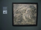
The exhibition pays a great deal of attention to the artist’s creative process. A distinctive trait of Toorop’s artistry was that he had no objections to the modification of his works at a later date, as is the case with The Sphynx. His attachment to the importance of this creative process exceeded that of a fixed end result. This was in line with the modern artistic views of the time. It would mean that he often enlarged drawings by sticking on extra pieces of paper; or he might make radical changes to works apparently finished years earlier; or he would even destroy works beyond repair, as is the case with Twilight, which he crossed out around 1895–96, adding the words “Deugt niet” (no good) (fig. 14). Just as eye-catching, but in a wholly different way, is Des chants de notre heure (Songs of our times) (1893). Influenced by Art Nouveau, Toorop here extended his drawing onto the inner frame (fig. 15). Although the work is moderate in scale, it has a monumental quality (87). At the time, artists paid a great deal of attention to their picture frames and regarded them as an integral part of the artwork.
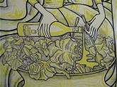
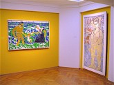
The print cabinets following the grand exhibition room function as both intermezzo and continuum. Here, Toorop’s involvement with applied arts is showcased, a development concurrent with the wish of modern artists to break free from the isolation of “high” art in favor of engagement and exchange with other arts and crafts. Starting in 1894 Toorop designed posters, book covers, and even a shop window for an art dealer (figs. 16, 17). The replica of the shop window that is incorporated in the exhibition is unfortunately an awkward oddity. Most famous is Toorop’s poster advertising salad oil produced in the Dutch city of Delft (fig. 18). The renown of this poster was so great that the Dutch often referred to Art Nouveau as ‘salad oil style’ (fig. 19). No less than five versions of this advertisement are displayed in one of the cabinets. The following cabinets contain very delicate drawings from around 1895, several of them depicting female figures in an etheric guise evoked by a haze of white pastel (fig. 20).
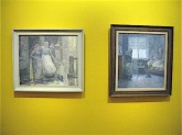
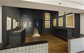
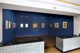
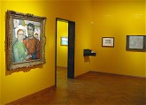
The section “The New, Mystical Life” takes up the lion’s share of the exhibition. It is followed by a far smaller section dedicated to Toorop’s depiction of the sea. The delightful pointillist coastal landscapes of 1899 represent the changing seasons and times of day (fig. 21). Other than his divisionist Neo-Impressionism of 1888–89, Toorop now chose to work in a very delicate and systematically placed pointille in light pastel colors (129). On the occasion of this exhibition, the museum’s walls were painted in bright colors that fit the Gemeentemuseum’s branding very well. But in this room, the flashy yellow clashes unpleasantly with the delicate tones of the paintings. The room further includes a showcase containing a couple of touching drypoint etchings depicting Toorop’s young daughter, Charley, who would grow up to become a celebrated artist herself. Highlights of the room, however, are the pointillist portraits of Mrs Bouman-de Lange (1898) and Mr Timmerman (1898–1900). The latter, known as The Printlover, is especially well executed; it shows the sitter holding a color lithograph by Henri de Toulouse-Lautrec (fig. 22).[8]
As I made my way through the exhibition I noticed most visitors were amazed by the diversity of Toorop’s work, and I overheard one visitor saying: “Each exhibition room is like a world on its own.” Very different indeed from the delicate seascapes of 1899 is the next room marking the beginning of the phase the exhibition organizers chose to refer to as “Labor and Faith.” Toorop, who himself thought of his oeuvre as divisible in different phases, refrained from Art Nouveau in 1902. His swirling linear style was replaced by a much more geometric linearity. Influenced by architect H. P. Berlage, Toorop advocated the notion of the communal Gesamtkunstwerk (total work of art) and believed that the plastic arts would reach great heights in merging with architecture. Berlage and Toorop appreciated each other greatly and Berlage asked Toorop to create decorative designs for his renowned Beurs van Berlage, the trading hall of Amsterdam. Toorop would ultimately make 25 designs for the Beurs, of which the three tile pictures for the front hall are most well known; they depict the Past, Present, and Future of the exchange business. The exhibition features a trial firing for a section of Present (fig. 23). It shows a strongly built laborer holding a sledgehammer as a symbol of participation in modern society, which is itself depicted in the background by means of smoking chimneys and a train.
The name of the section “Labor and Faith” refers to a painting with the similar title Faith and Remuneration (1901–02), which has an autobiographical character. Toorop had “poured out his state of feeling of the time” into this painting (fig. 24). He had severe marital problems with his wife Annie Hall whom he had married in 1886. They had been living “separated from bed” for many years and were on the verge of a divorce. The two had almost irreconcilable differences about religion; Annie was living more and more according to a devout Catholic conviction, while Toorop, with his Protestant background, lived the life of an artist. He believed that if he adhered to the Catholic faith too rigorously, he would lose the spirit that nurtured his artistic labor (148–50). This is what is expressed in Faith and Remuneration; the fisherman is unsatisfied with his meagre pay and is doubting his religious belief, exemplified by the illustration of Christ in a shattered picture frame in the background. Toorop hereby rebelled against his wife’s restricted opinion of good faith and the limiting effect this had on his artistic spirit.
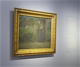
It is in this light that we must understand Toorop’s ultimate conversion to Catholicism in 1905. In becoming reconciled with his wife, Toorop opened up to the Catholic faith. He claimed that after a long search and great suffering, he found a true and pure connection with God through the Roman Catholic Church (156). The chapter “Arbeid en geloof” (Labor and Faith) is the most interesting part of the exhibition catalogue. Van Wezel managed to give thoughtful insight into this complex aspect of Toorop and his art. After many turbulent years, Toorop entered a phase in his life when he felt much more at ease. This is reflected in the everyday scenes of rural life that he made in the summers of 1904 and 1905 in the area of Domburg. The Divisionist style he now turned to was characterized by a much broader touch as opposed to the refined Pointillism of the earlier coastal landscapes. This can be seen for example in Toorop’s poetic rendering of Labour (The Lumberman) (1905). The late afternoon sun is beautifully conveyed by the juxtaposing of greens and lilacs, yellows and pinks; “A Fanfare of Light and Color” (fig. 25).
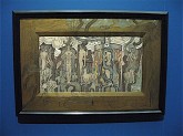
The fifth and final stage of Toorop’s career is designated as “Figuration and Geometry” and is dominated by his religious belief (fig. 26). A more opportunistic reason for Toorop to convert to Catholicism might have been the opportunity for new commissions of a grander scale (205). For a long time, Toorop aspired to create monumental art, and at this period the Catholic Church was looking for new modern visual means to convey its message. Artists like Toorop, who sought to give representations of universal spiritual life, suited this aspiration (209). By abstracting figurative art, Toorop could bring higher truths into the limelight. The goal was to get to the essence of figuration, not to abandon it in favor of abstraction. This resulted in figurative scenes with symmetrical compositions and geometrical volumes, as can be seen in Stations of the Cross (1916). Toorop used the cross to dissect the picture plane, giving it a rhythmic movement of line (229–30) (fig. 27). This same clarity of composition is manifest in his late work, for example Prayer (1924) (fig. 28). The stylized heads and meditative figures that occupy this painting exemplify the work of Toorop’s final years.
Up to the very end of his life the struggle between diverging forces and the pursuit of inner peace that is continually conflicted by passionate desires remained at the core of Toorop’s artistic motivation. The Pilgrim (1921) is another highly meaningful autobiographical work (fig. 29). It serves as an allegory for the path of life. Man is a diligent worker, who, led by the light of God’s love (embodied by the radiating heart) is forever searching for elevation. Mary and the baby Jesus are awaiting the pilgrim with open arms. Many might regard this large drawing in black chalk and charcoal as a ponderous or melancholy final piece, and in fact it was considered as such when it was first exhibited. Toorop objected strongly to this interpretation, and claimed he had experienced “heavenly” pleasure at making it and considered it a “perfection” (albeit not completion) of his body of work (244). Jan Toorop passed away in 1928.
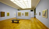
From the late 1890’s onward, Toorop always had numerous portrait commissions, which served as an important source of income (185). A selection of Toorop’s portraits, both commissioned and non-commissioned, are served up as an encore (fig. 30). These are squeezed into a screened off part of a larger exhibition room. This is a pity, for the choice selection of portraits is marvelous, and it is once more very clear that Toorop was a masterly draughtsman. Putting together a retrospective exhibition is not an easy task. Do you show an overview of an artist’s entire oeuvre? And in equal proportions? The answer in this case seems to have been a whole-hearted “Yes.” The horror vacui (fear of empty space) that is characteristic of Toorop’s most renowned art nouveau symbolist works was in a sense transmitted to the exhibition organizers. The overall exhibition would have benefited from a somewhat sharper selection.
Apart from this considerable reservation, the exhibition deserves much praise. The exhibition and accompanying catalogue constitute a profound contribution to the knowledge of Jan Toorop. Not only does the exhibition show the artist’s oeuvre in its entirety, in all its complexity and diversity, but also Van Wezel’s decades-long research resulted in a stylistic chronological rearranging of the artist’s oeuvre. The linking narrative in Toorop’s oeuvre of “life as a painful struggle between antitheses of every kind” is convincingly conveyed throughout the entire presentation. Exhibition visitors are treated to a large amount of “salad oil style” works for which Toorop is most celebrated, and pleasantly surprised by the artist’s pointillist coastal landscapes and a variety of excellent portraits. For many, his later religious works will be less easily digestible. But in the catalogue, Van Wezel did a very good job of explaining this body of work. The exhibition certainly provides all the information needed to form a considered opinion about whether or not Jan Toorop lives up to the ambition of the exhibition organizers to rank Toorop alongside Mondrian and Van Gogh. Those who do not wish to make such a comparative assessment should simply allow themselves to “penetrate the labyrinth of their imagination” and marvel in Toorop’s draftsmanship, especially in the beauty of the details.
Lisa Smit
Art historian
I am greatly indebted to guest curator and Toorop expert Gerard van Wezel for his explanation of the coming together of the exhibition, and for his impassioned stories about his decades-long research on Toorop’s oeuvre.
All translations are by the author unless otherwise indicated.
[1] As guest curator, Gerard van Wezel worked alongside curator Hans Janssen of the Gemeentemuseum.
[2] Toorop in Vienna: Inspiring Klimt (October 7, 2006–January 7, 2007) by guest curator Marian Bisanz-Prakken. See http://www.gemeentemuseum.nl/en/exhibitions/toorop-in-vienna-inspiring-klimt.
[3] Based on the museum’s sizeable collection of Toorop’s work, the Gemeentemuseum has a long history of Toorop exhibitions, including retrospective exhibitions in 1940 and in 1987. Also see Carel Blotkamp et al., Kunstenaren der idee: Symbolistische tendenzen in Nederland, ca. 1880–1930 (Artists of Conception: Symbolist Tendencies in the Netherlands, ca. 1880–1930), exh. cat. (The Hague: Haags Gemeentemuseum, 1978); Maurice Tuchman, Judi Freeman and Carel Blotkamp, The Spiritual in Art: Abstract Painting 1890–1985 (New York: Abbeville Press, 1986); Marian Bisanz-Prakken, Toorop/Klimt: Toorop in Vienna, Inspiring Klimt, exh. cat. (The Hague: Gemeentemuseum; Zwolle: Waanders, 2006).
[4] See Joniek van Es en D. Valentijn, Het laatste meesterwerk van Hendrik Petrus Berlage: de geschiedenis en restauratie van het Gemeentemuseum Den Haag (The Last Masterpiece of Hendrik Petrus Berlage: History and Restauration of the Gemeentemuseum, The Hague) (Zwolle: Waanders, 2000).
[5] According to Pierre Bourdieu, it is a misconception that the “author” (e.g. the writer, the artist, the composer) is the one and only creator of the product (e.g. the book, the painting, the composition). Because who creates the creator? The critic discovers new talent and guides the public’s opinion through its verdict. The critic either contributes to an artwork’s consecration, or detracts from it. Finally, the public itself is responsible as creator by appropriating the artworks materially (as collectors) or symbolically (as audience). See Pierre Bourdieu, The Field of Cultural Production (New York: Columbia University Press, 1993), 74–8.
[6] When the arts were “liberated from the authority of guilds, princes, the state and the academies” they were at the same time “robbed” of their support. Art now had to rely on itself and the artist could only be legitimized through his art, which meant he “could only be legitimated by maintaining he is a genius.” When, due to the influence of the Impressionists, the age-old selection system of “good” art shifted from a peer-based selection to an expert-based selection, the standard of quality changed with it. Innovation became the number one criterion for appreciation and hence for a good reputation. Art dealers, critics, and museums became the experts, denominating “good” art on the basis of innovation. See Oskar Bätschmann, The Artist in the Modern World: The Conflict Between Market and Self-expression (New Haven: Yale University Press, 1997), 58; 66.
[7] Citation from Berliner Tageblatt (December 20, 1893) in Gerard van Wezel, Jan Toorop: Zang der tijden (Jan Toorop: Songs of Our Times) (The Hague: Gemeentemuseum; Zwolle: WBOOKS, 2016), 79.
[8] The depicted print is Henri de Toulouse-Lautrec’s Mademoiselle Marcelle Lender, En Buste, 1895. Color lithograph. Image 32.5 x 24.4 cm; Sheet 35.6 x 27.7 cm. Cat. rais. Wittrock 99.
